Chrzanów [ˈxʂanuf] is a quiet town in southern Poland, located between Kraków and Katowice. Many of its young inhabitants more often decide to move to neighboring agglomerations in search of new perspectives. Over the past 15 years, nearly 3,000 young people have left Chrzanów. In response, the Chrzanów authorities decided to react and work on making the city’s image more attractive. We have been selected from over a dozen top branding agencies to prepare the city's communication concept and its full visual identity.
Year
2019
Scope
Brand design, brand manual, collateral, copywriting, corporate & verbal identity, outdoor, print design, signage & wayfinding


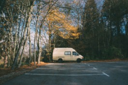


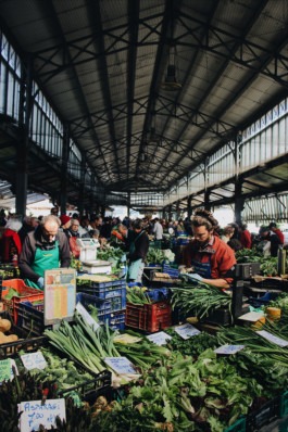
We wanted to emphasize that Chrzanów has its own character, is unique, confident, with a sense of humor and distance, and that it has many other advantages for which it is worth living in.
We are not trying to prove that Chrzanów is as attractive as Krakow or Katowice (Silesia). However, it has many valuable features and we want to talk about them.

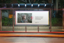
The perverse nature of the message lies in its construction. The message consists of two parts - a sentence beginning with "In some cities ..." illustrating their flaws, and a permanent closing part: “Chrzanów this”.
The first sentence has a passive form to avoid indicating which city is affected by the negative feature. However, it suggests that we are talking about the city in which the adv is located. The slogan “Chrzanów this” identifies the sender of the message as being the inhabitant of Chrzanów. On the other hand, the term is sonically close to the colloquial “screw it” in Polish in the sense of “I don't want it.” In this humorous way we show the disadvantages of living in a big city, which we contest and give an alternative.
The construction of the sign is based on the geometry of the municipal crest and locomotive wheels (a reference to “Fablok”, the first in Poland locomotive factory, which is the historical pride of the inhabitants and one of the most important associations with the city). However, we leave room for further interpretation.
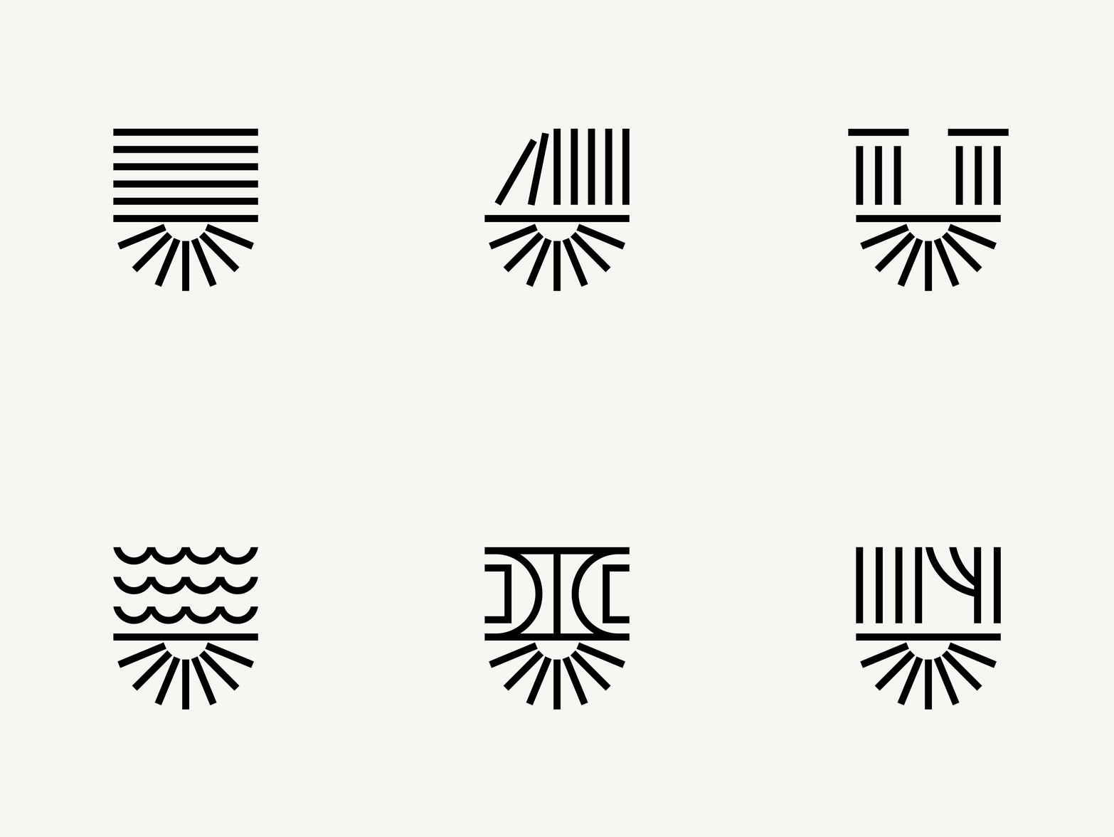
The symbol changes for different organizational entities. The upper part adopts the shapes relevant to the context. The lower, “radiant” part remains a permanent element. The signet ring is minimalist in form, which makes it easier to receive in the midst of the information noise of the surroundings. The letters of the logotype are characteristic, unusual and self-confident; aesthetically consistent with the signet geometry.
The employees of the municipal entities wanted to build a system and show the residents that the city has a lot to offer and that what it does is consistent — both substantively and visually. At the same time, the target was to preserve and emphasize the thematic separateness of the areas of activity — each entity has its own sign and colors assigned to a given category, such as: culture, health, sport and education.
We based the identity on the Founders Grotesk typeface designed by Klim Type Foundry. Founders Grotesk is a modern typeface perfectly adapted to the current media requirements. It is characterized by the finesse and simplicity of form and high legibility.
Moreover, Crimson Italic, a serif typeface that uses soft lines to break through the geometry of basic typography, is used in the collaterals. This contrast makes those materials more pleasant to receive and adds elegance to geometric layouts.

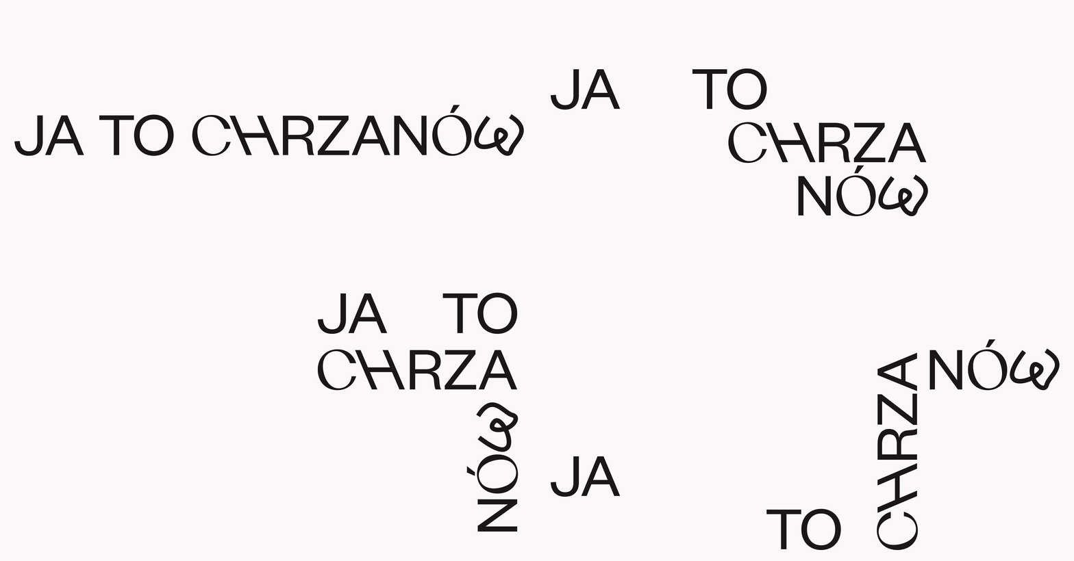
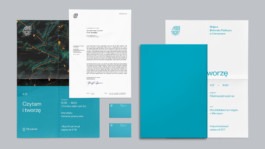
consistent with his idea. The materials attract attention with a style that boldly uses the variable width and slope of the typeface. With this treatment, we depart from the generally accepted standards of formal and official documentation and introduce an atmosphere closer to the inhabitants.
Additional colors are dedicated to organizational units and related categories of activity — education, sport, culture and healthcare.
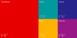
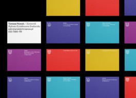
They differ in colors (depending on the subject area) and sign. Thanks to this, the creation of materials should be simpler, cheaper and, above all, the media will be easily to read for residents.
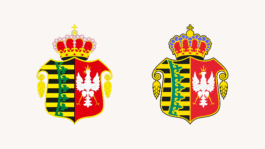
The original vector design was created many years ago and over time the source file has become useless due to the changes applied and errors resulting from the use of outdated software, which can be seen in proximity. The elements were broken, mismatched, overlapped. It was illegible in print, it had no a black and white version. Moreover, there were two similar but in fact different to each other versions of the crest.
Recreation of the town crest required designing it from scratch, though based on the source and rigid guidelines. We’ve improved the details, construction and colors. We cleaned of unnecessary graphic elements. We have technically improved the crest's design and achieved the right balance.


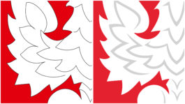
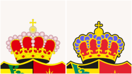

The two versions prepared — the basic and the achromatic one — allow you to use the crest on all types of media. As a result, it meets the functional and aesthetic requirements in official documents, promotional materials, wall decorations and others.

It consists of two directions — the formal and the informal ones — combined to varying degrees depending on the needs and context. In the case of formal communication, we focused on functionality, so the visual language is subdued and the number of non-standard treatments is minimal. For informal communication, we decided to experiment with form and typography. In most of the materials, we tried to intertwine both directions, giving the Chrzanów brand a self-confident character, respecting the principles, and at the same time allowing ourselves to skillfully deviate from them.
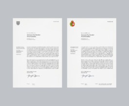
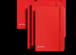
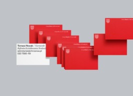
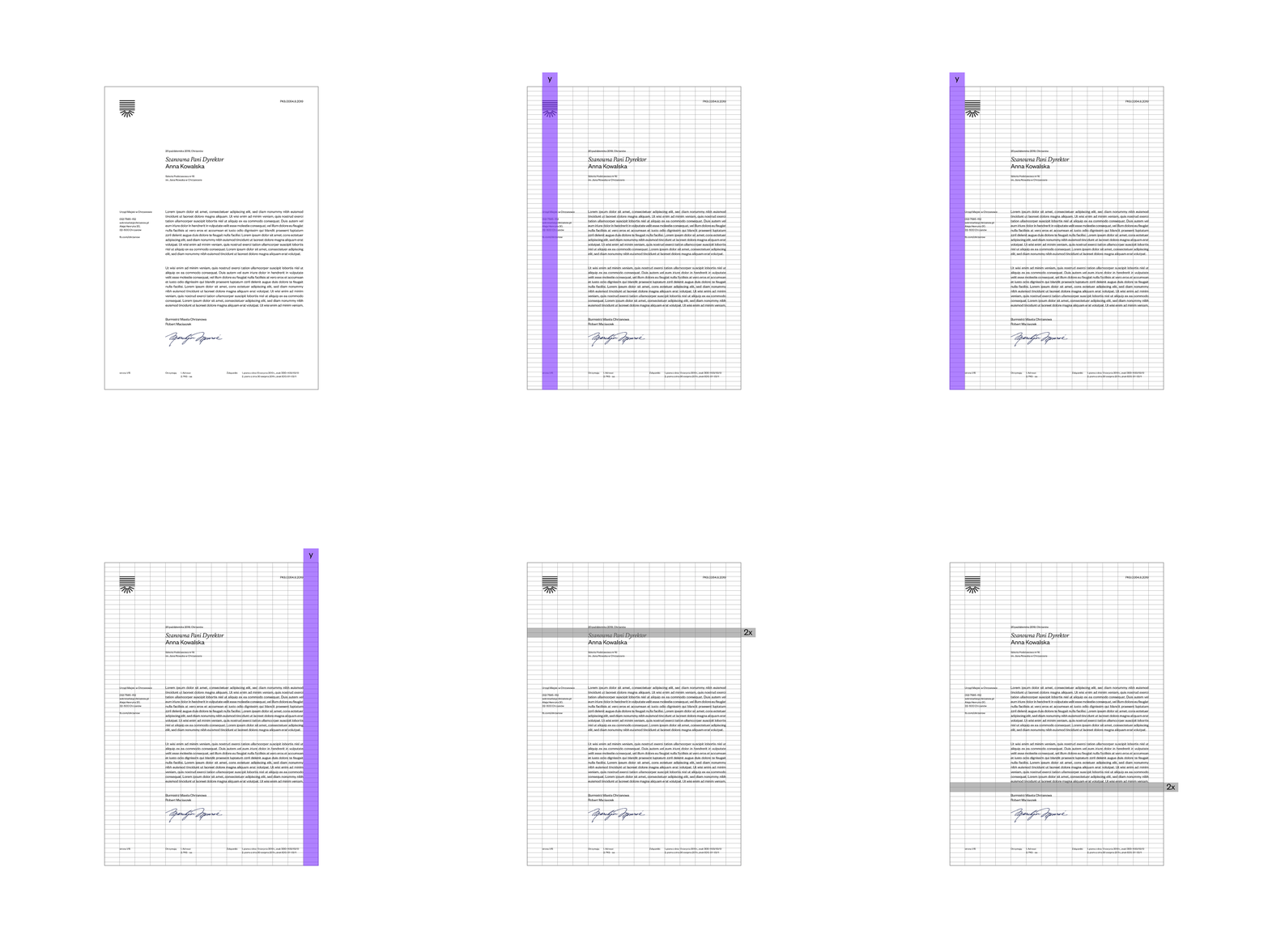
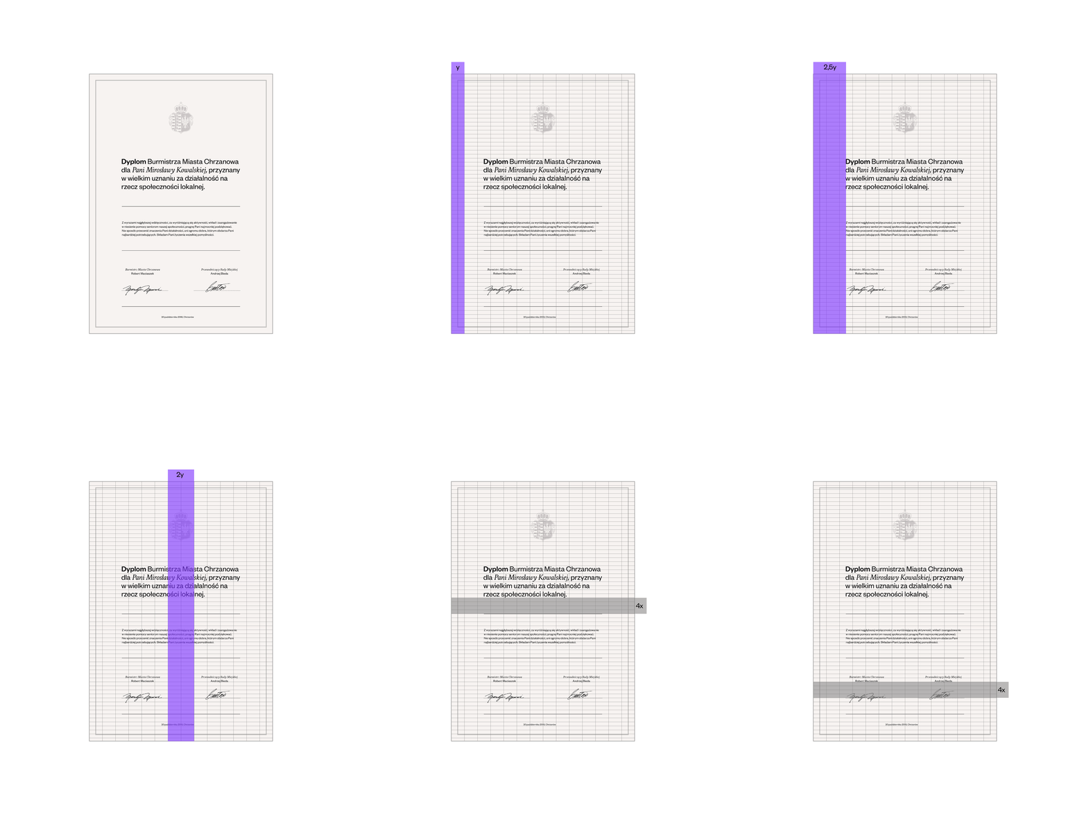


Each of them had to be designed, prepared and described in such a way that even a non-designer could work with the use of it. Documents, presentations and other templates have been adapted to the needs of the institution’s employees. Each of them must effectively use the new tools in accordance with the established brand principles, so that the city’s identity remains consistent and intact for years.
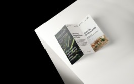
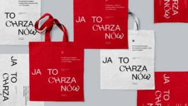
In addition to the promotion of the city in its surroundings, the mechanics of the slogan “Chrzanów this” will be developed by us and used on carriers and materials for residents as a platform communicating the values of a slow life city. For example, we will see the slogan on the bag: “In some cities, the handbag is chosen to match the shoes. Chrzanów this.” And on a paper cup: “Some cities are full of plastics. Chrzanów this.”
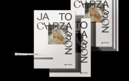
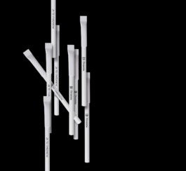
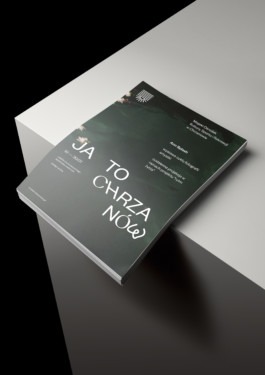
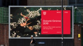

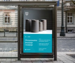

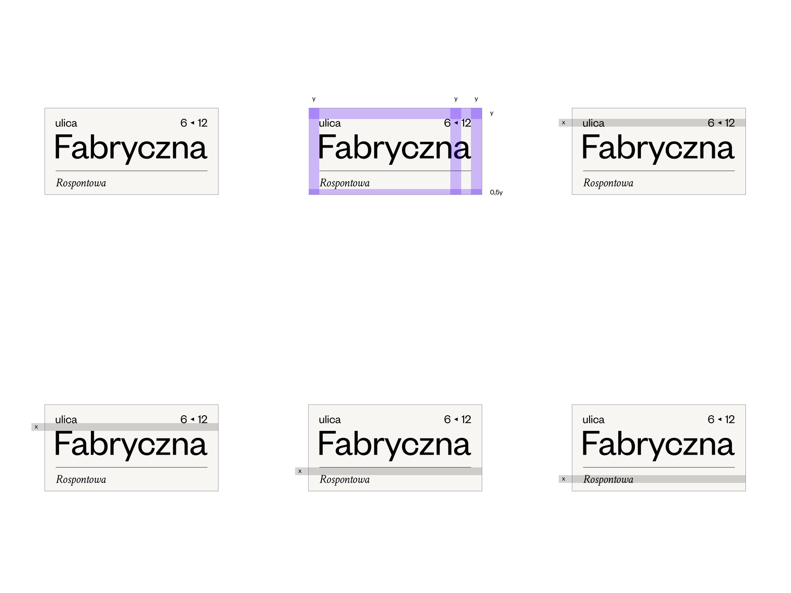
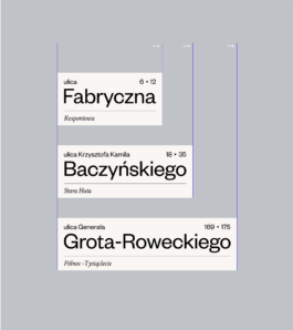
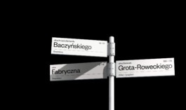
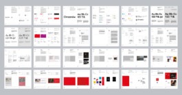
This over 100-page document we have developed as a tool for everyday work for people responsible for promoting the city and communicating all activities of individual institutions. It sets the rules for using the logo and town crest, as well as describes the construction and method of creating materials.
Visual Identity: Natalia Bilska, Jarosław Dziubek

Year
2019
Scope
Brand design, brand manual, collateral, copywriting, corporate & verbal identity, outdoor, print design, signage & wayfinding
Chrzanów [ˈxʂanuf] is a quiet town in southern Poland, located between Kraków and Katowice. Many of its young inhabitants more often decide to move to neighboring agglomerations in search of new perspectives. Over the past 15 years, nearly 3,000 young people have left Chrzanów. In response, the Chrzanów authorities decided to react and work on making the city’s image more attractive. We have been selected from over a dozen top branding agencies to prepare the city's communication concept and its full visual identity.


We wanted to emphasize that Chrzanów has its own character, is unique, confident, with a sense of humor and distance, and that it has many other advantages for which it is worth living in.
We are not trying to prove that Chrzanów is as attractive as Krakow or Katowice (Silesia). However, it has many valuable features and we want to talk about them.

The perverse nature of the message lies in its construction. The message consists of two parts - a sentence beginning with "In some cities ..." illustrating their flaws, and a permanent closing part: “Chrzanów this”.
The first sentence has a passive form to avoid indicating which city is affected by the negative feature. However, it suggests that we are talking about the city in which the adv is located. The slogan “Chrzanów this” identifies the sender of the message as being the inhabitant of Chrzanów. On the other hand, the term is sonically close to the colloquial “screw it” in Polish in the sense of “I don't want it.” In this humorous way we show the disadvantages of living in a big city, which we contest and give an alternative.
The construction of the sign is based on the geometry of the municipal crest and locomotive wheels (a reference to “Fablok”, the first in Poland locomotive factory, which is the historical pride of the inhabitants and one of the most important associations with the city). However, we leave room for further interpretation.


The symbol changes for different organizational entities. The upper part adopts the shapes relevant to the context. The lower, “radiant” part remains a permanent element. The signet ring is minimalist in form, which makes it easier to receive in the midst of the information noise of the surroundings. The letters of the logotype are characteristic, unusual and self-confident; aesthetically consistent with the signet geometry.

The employees of the municipal entities wanted to build a system and show the residents that the city has a lot to offer and that what it does is consistent — both substantively and visually. At the same time, the target was to preserve and emphasize the thematic separateness of the areas of activity — each entity has its own sign and colors assigned to a given category, such as: culture, health, sport and education.

We based the identity on the Founders Grotesk typeface designed by Klim Type Foundry. Founders Grotesk is a modern typeface perfectly adapted to the current media requirements. It is characterized by the finesse and simplicity of form and high legibility.
Moreover, Crimson Italic, a serif typeface that uses soft lines to break through the geometry of basic typography, is used in the collaterals. This contrast makes those materials more pleasant to receive and adds elegance to geometric layouts.

consistent with his idea. The materials attract attention with a style that boldly uses the variable width and slope of the typeface. With this treatment, we depart from the generally accepted standards of formal and official documentation and introduce an atmosphere closer to the inhabitants.

Additional colors are dedicated to organizational units and related categories of activity — education, sport, culture and healthcare.

They differ in colors (depending on the subject area) and sign. Thanks to this, the creation of materials should be simpler, cheaper and, above all, the media will be easily to read for residents.


The original vector design was created many years ago and over time the source file has become useless due to the changes applied and errors resulting from the use of outdated software, which can be seen in proximity. The elements were broken, mismatched, overlapped. It was illegible in print, it had no a black and white version. Moreover, there were two similar but in fact different to each other versions of the crest.
Recreation of the town crest required designing it from scratch, though based on the source and rigid guidelines. We’ve improved the details, construction and colors. We cleaned of unnecessary graphic elements. We have technically improved the crest's design and achieved the right balance.


The two versions prepared — the basic and the achromatic one — allow you to use the crest on all types of media. As a result, it meets the functional and aesthetic requirements in official documents, promotional materials, wall decorations and others.


It consists of two directions — the formal and the informal ones — combined to varying degrees depending on the needs and context. In the case of formal communication, we focused on functionality, so the visual language is subdued and the number of non-standard treatments is minimal. For informal communication, we decided to experiment with form and typography. In most of the materials, we tried to intertwine both directions, giving the Chrzanów brand a self-confident character, respecting the principles, and at the same time allowing ourselves to skillfully deviate from them.


Each of them had to be designed, prepared and described in such a way that even a non-designer could work with the use of it. Documents, presentations and other templates have been adapted to the needs of the institution’s employees. Each of them must effectively use the new tools in accordance with the established brand principles, so that the city’s identity remains consistent and intact for years.

In addition to the promotion of the city in its surroundings, the mechanics of the slogan “Chrzanów this” will be developed by us and used on carriers and materials for residents as a platform communicating the values of a slow life city. For example, we will see the slogan on the bag: “In some cities, the handbag is chosen to match the shoes. Chrzanów this.” And on a paper cup: “Some cities are full of plastics. Chrzanów this.”


This over 100-page document we have developed as a tool for everyday work for people responsible for promoting the city and communicating all activities of individual institutions. It sets the rules for using the logo and town crest, as well as describes the construction and method of creating materials.

Visual Identity: Natalia Bilska, Jarosław Dziubek