The whole project was commissioned by the Ministry of Infrastructure and the Polish Ministry of Regional Development. The investment was also tagged as a strategic one for the Polish State in connection with the implementation of the final tournament of the 2012 UEFA European Championship.
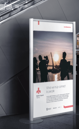
Design works covered nearly 30 branding elements and a comprehensive brand manual. From the logo, brand colours, typography, through outdoor advertising, templates of presentations, press release and other official documentation, to promotional gadgets and accessories.
Year
2012
Scope
Brand design, brand manual, collateral, copywriting, corporate & verbal identity, outdoor, print design.

– timeless, very simple and geometric – strongly suggests the professionalism of the carrier as well as its purpose. Logo shows what the project is: a railway to the airport. It was targeted to the broad audiences of all ages and backgrounds.
- Ministry of Regional Development

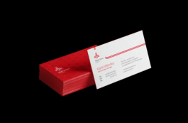
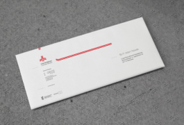
Since red predominates in airline brandings, the expected associations are with dynamics, technology and effectiveness. The technical grey, on the other hand, brings a necessary balance in the form of trustworthiness and respectability.
- Ministry of Regional Development

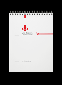
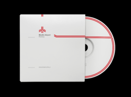
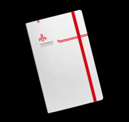
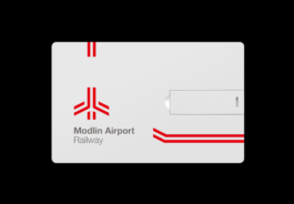
It is a classic of excellent design and perfect readability. Dynamic yet dignified, approachable yet professional, clean and straightforward.
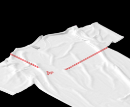
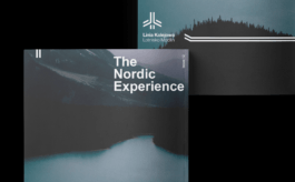
and bases its functionality on consistency, flexibility and aesthetics. The two red lines, symbolising railway tracks, lead through all the materials and create the logo. Those elements flexibly work with layouts depend on their content. For example, though most often the logo is placed at the very top, when used with a photo it moves to the bottom. Logo works well in every format and guarantees the geometrically based aesthetics of the whole identity, thanks to the materials’ grid architecture which was based on logo proportions.


- Ministry of Regional Development


Year
2012
Scope
Brand design, brand manual, collateral, copywriting, corporate & verbal identity, outdoor, print design.
The whole project was commissioned by the Ministry of Infrastructure and the Polish Ministry of Regional Development. The investment was also tagged as a strategic one for the Polish State in connection with the implementation of the final tournament of the 2012 UEFA European Championship.
Design works covered nearly 30 branding elements and a comprehensive brand manual. From the logo, brand colours, typography, through outdoor advertising, templates of presentations, press release and other official documentation, to promotional gadgets and accessories.

– timeless, very simple and geometric – strongly suggests the professionalism of the carrier as well as its purpose. Logo shows what the project is: a railway to the airport. It was targeted to the broad audiences of all ages and backgrounds.
- Ministry of Regional Development


Since red predominates in airline brandings, the expected associations are with dynamics, technology and effectiveness. The technical grey, on the other hand, brings a necessary balance in the form of trustworthiness and respectability.
- Ministry of Regional Development


It is a classic of excellent design and perfect readability. Dynamic yet dignified, approachable yet professional, clean and straightforward.

and bases its functionality on consistency, flexibility and aesthetics. The two red lines, symbolising railway tracks, lead through all the materials and create the logo. Those elements flexibly work with layouts depend on their content. For example, though most often the logo is placed at the very top, when used with a photo it moves to the bottom. Logo works well in every format and guarantees the geometrically based aesthetics of the whole identity, thanks to the materials’ grid architecture which was based on logo proportions.


- Ministry of Regional Development


