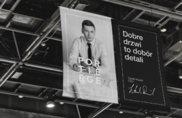
Portierge is an award-winning woodwork dealer offering mid- and high-end products. The company’s philosophy, “Good products for the good of people”, suggest that items should contribute to everyone’s welfare, and not distract attention with low quality or bad design. We were asked to create the brand’s image based on Portierge’s ideology and the motto that “good woodwork is a selection of details”.
Year
2013
Scope
Branding, collateral, corporate identity, print design, web design, interior design, packaging design, photo shooting, signage & wayfinding, copywriting, press ads.

To align with the company’s focus on good and responsible design, we reached to the ideology of the Bauhaus movement, the avant-garde of the modern classical style. The grandioseness gave space to the functionalist with sharp geometrical aesthetics filling the “less is more” credo.
Marius Geddes
COO, Portierge
The elegance comes through the geometry of the sphere, a feel of precision and mathematical perfection. The two- and three-dimensionality is a thing of interpretation, and that’s what we wanted – to engage both intellectually and emotionally.
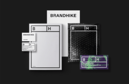
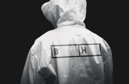
The logo can be used both horizontally and vertically, making it very flexible in terms of application in various media. It also emphasises the idea of an ever-changing architectural sphere – a room or perhaps a building, which is open for interpretation.


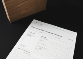
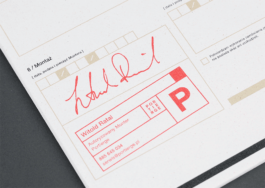
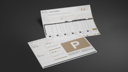
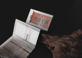
due to their complexity and the amount of content required on a relatively small space. What we found interesting during the process, were those little things related to the character of the company and the industry itself. For example, the set of columns in the table was fixed in a way which helped fitters fill the cells faster and in the order of conducted measurements.

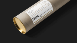
even though the price range of products was medium-high. Following the brand’s ideology, our goal was to give customers more than expected, considering this as what should be the market’s standard – not an exception, merely a marketing tool. With a beautiful design, thoughtful copywriting, aesthetics of imagery, quality of paper, focus on detail, we hoped to raise the bar and set standards unprecedented in the type of business represented by Portierge.

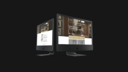
since Portierge’s principal operations are online. Understandably it had to be as custom made and eye-catching as possible. Tens of icons were designed to enrich products information, as well as make it friendlier to the casual customer, which – most of the time – had little to no knowledge about the woodwork. “Good products for the good of people” motto resonates within the website’s design – beautiful, accessible and useful.

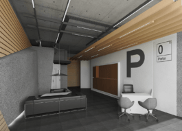
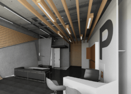
While supervising architects’ work on the showroom, our priority was to ensure that the customer will have a feeling of being at the spotlight – welcomed, taken care of, comfortable. We wanted to create a space for dialogue with the consultant, so the products were moved to the back, shown after the initial interview.
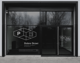
The shop window welcomes with confidence and style, and at the same time makes it easy for a passerby to see the interior, and the sun to lighten up the room.
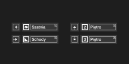
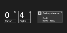
Just like in the case of the website, the pictogram system for the showroom had to be designed from scratch. A customer awaiting the sales advisor, or just getting acquainted with the showroom, has plenty of time to notice every small detail of the surroundings. We wanted to make sure that those details are exquisite.

We’ve designed all the elements required for sales advisors and fitters to build this first and best impression. Having the full arsenal of branded tools also strengthened the team’s morale, enhanced the feeling of belonging and introduced a new level of pride.


→ Increased trust and respect from Portierge’s business partners, resulting in more profitable deals.
→ More favourable negotiating position thanks to a high credibility image of the company.
→ Increased customer confidence in Portierge and more favourable word-to-mouth and social media opinions.
→ The design industry’s recognition and awards resulted in cost-free PR advertising.
→ It also increased staff morale and motivation, which turned into higher efficiency.
→ It overall increased company value.
→ STGU Project of the Year — 2013
→ IWP Good Design — 2014
→ Red Dot Award, Brand Design — 2015
Strategy: Maciej Frymus
Visual Identity: Adrian Spóz
Year
2013
Scope
Branding, collateral, corporate identity, print design, web design, interior design, packaging design, photo shooting, signage & wayfinding, copywriting, press ads.
Portierge is an award-winning woodwork dealer offering mid- and high-end products. The company’s philosophy, “Good products for the good of people”, suggest that items should contribute to everyone’s welfare, and not distract attention with low quality or bad design. We were asked to create the brand’s image based on Portierge’s ideology and the motto that “good woodwork is a selection of details”.
Marius Geddes
COO, Portierge
The elegance comes through the geometry of the sphere, a feel of precision and mathematical perfection. The two- and three-dimensionality is a thing of interpretation, and that’s what we wanted – to engage both intellectually and emotionally.
The logo can be used both horizontally and vertically, making it very flexible in terms of application in various media. It also emphasises the idea of an ever-changing architectural sphere – a room or perhaps a building, which is open for interpretation.
due to their complexity and the amount of content required on a relatively small space. What we found interesting during the process, were those little things related to the character of the company and the industry itself. For example, the set of columns in the table was fixed in a way which helped fitters fill the cells faster and in the order of conducted measurements.
even though the price range of products was medium-high. Following the brand’s ideology, our goal was to give customers more than expected, considering this as what should be the market’s standard – not an exception, merely a marketing tool. With a beautiful design, thoughtful copywriting, aesthetics of imagery, quality of paper, focus on detail, we hoped to raise the bar and set standards unprecedented in the type of business represented by Portierge.
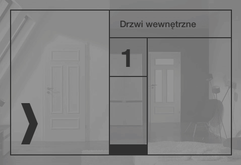
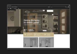
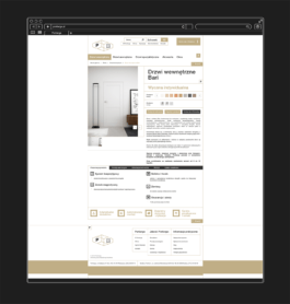
since Portierge’s principal operations are online. Understandably it had to be as custom made and eye-catching as possible. Tens of icons were designed to enrich products information, as well as make it friendlier to the casual customer, which – most of the time – had little to no knowledge about the woodwork. “Good products for the good of people” motto resonates within the website’s design – beautiful, accessible and useful.
While supervising architects’ work on the showroom, our priority was to ensure that the customer will have a feeling of being at the spotlight – welcomed, taken care of, comfortable. We wanted to create a space for dialogue with the consultant, so the products were moved to the back, shown after the initial interview.
The shop window welcomes with confidence and style, and at the same time makes it easy for a passerby to see the interior, and the sun to lighten up the room.
Just like in the case of the website, the pictogram system for the showroom had to be designed from scratch. A customer awaiting the sales advisor, or just getting acquainted with the showroom, has plenty of time to notice every small detail of the surroundings. We wanted to make sure that those details are exquisite.
We’ve designed all the elements required for sales advisors and fitters to build this first and best impression. Having the full arsenal of branded tools also strengthened the team’s morale, enhanced the feeling of belonging and introduced a new level of pride.
→ Increased trust and respect from Portierge’s business partners, resulting in more profitable deals.
→ More favourable negotiating position thanks to a high credibility image of the company.
→ Increased customer confidence in Portierge and more favourable word-to-mouth and social media opinions.
→ The design industry’s recognition and awards resulted in cost-free PR advertising.
→ It also increased staff morale and motivation, which turned into higher efficiency.
→ It overall increased company value.
→ STGU Project of the Year — 2013
→ IWP Good Design — 2014
→ Red Dot Award, Brand Design — 2015
Strategy: Maciej Frymus
Visual Identity: Adrian Spóz