Sundose – sunshine of your day°
Sundose is a dietary supplement created in Poland, the first personalized dietary supplement in Europe tailored to individual needs based on an online interview and blood tests.
Year
2022
Scope
→ Logo redesign
→ New color palette
→ New typography
→ Packaging design
→ Copywriting
→ Art direction
In 2021, the Lublin-based startup felt the need to change and develop its visual identity. The new look of the brand was to better fit the new communication strategy. Signal credibility, natural origin of ingredients, medical nature of the product and its high quality.
Logotype°
We have retained the overall structure of the logotype. The typography and the mark have been simplified.
The degree symbol ° was introduced.
Layout°
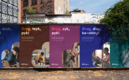
We turned orange into tangerine and complemented it with a new palette.
The redesigned colors open up new layout possibilities. The brand sends a clear and positive message to the outside world.
Sometimes the colors will mix on promotional materials.
Packaging°
Sundose is available in the Polish, German, British and Italian markets.
Personalization and offer are reflected in the extensive use of a range of colors.
The sachet contains only what you really need, and each ingredient is tailored to your body and lifestyle to ensure maximum effectiveness of the supplement - all in one sachet prepared for each day.
At the level of artistic direction, the brand follows its DNA and communication strategy.
Vibrant colors, bold proportions and radiant faces are the brand's signals.
Sundose was listed as one of the 10 most promising Polish startups in 2021.
Packaging design:
Natalia Kotkowska
Identity design:
Natalia Kotkowska
Additional designs:
Jarosław Dziubek
Copywriting:
Łukasz Słotwiński
Photography:
Sundose°
Project Manager:
Agata Sędzikowska
Year
2022
Scope
→ Logo redesign
→ New color palette
→ New typography
→ Packaging design
→ Copywriting
→ Art direction
Sundose is a dietary supplement created in Poland, the first personalized dietary supplement in Europe tailored to individual needs based on an online interview and blood tests.
In 2021, the Lublin-based startup felt the need to change and develop its visual identity. The new look of the brand was to better fit the new communication strategy. Signal credibility, natural origin of ingredients, medical nature of the product and its high quality.
Logotype°
We have retained the overall structure of the logotype. The typography and the mark have been simplified.
The degree symbol ° was introduced.
Layout°
We turned orange into tangerine and complemented it with a new palette.
The redesigned colors open up new layout possibilities. The brand sends a clear and positive message to the outside world.
Packaging°
Sundose is available in the Polish, German, British and Italian markets.
Personalization and offer are reflected in the extensive use of a range of colors.
The sachet contains only what you really need, and each ingredient is tailored to your body and lifestyle to ensure maximum effectiveness of the supplement - all in one sachet prepared for each day.
At the level of artistic direction, the brand follows its DNA and communication strategy.
Vibrant colors, bold proportions and radiant faces are the brand's signals.
Sundose was listed as one of the 10 most promising Polish startups in 2021.
Packaging design:
Natalia Kotkowska
Identity design:
Natalia Kotkowska
Additional designs:
Jarosław Dziubek
Copywriting:
Łukasz Słotwiński
Photography:
Sundose°
Project Manager:
Agata Sędzikowska