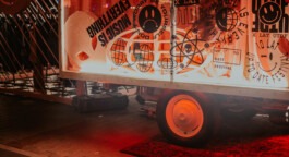
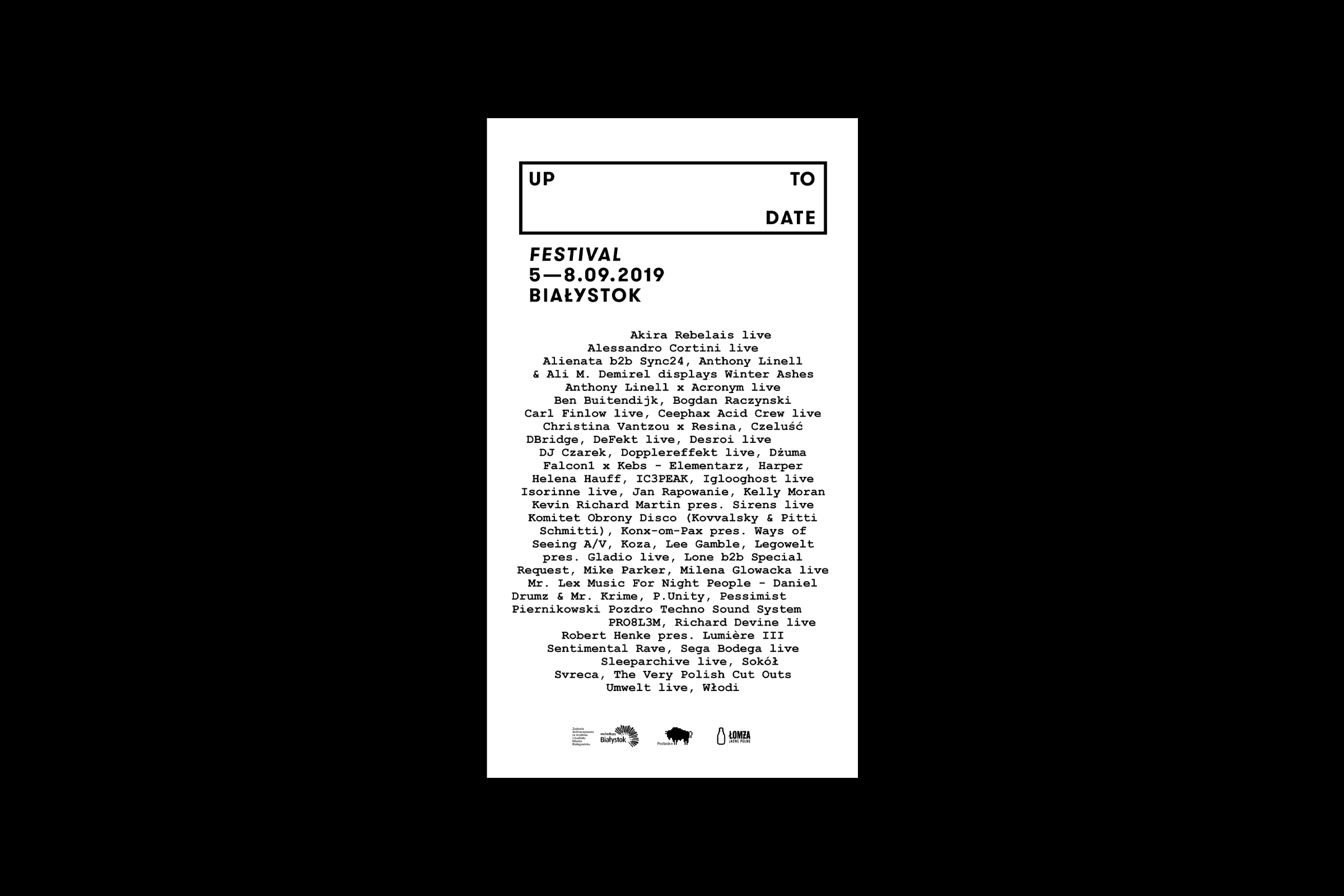
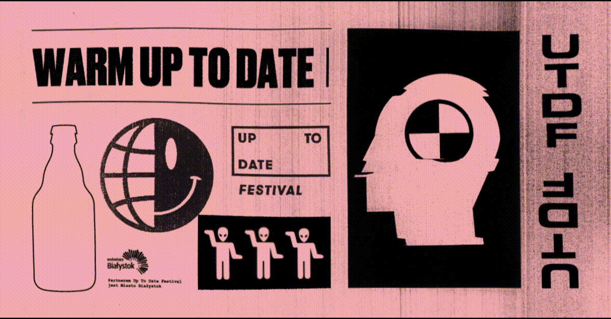
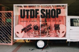
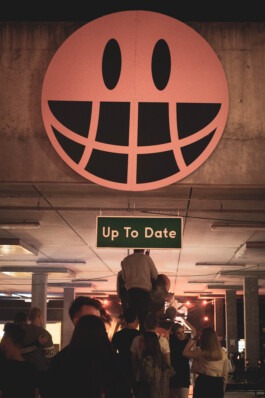
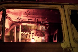
Up to Date is the most awarded music festival in Białystok, Poland. The repertoire consists mainly of hip-hop and electronic music, addressed to many audiences - both younger and older. The organisers' mission is not only to unite generations but also to break stereotypes related to techno music, which is to be helped by their original project Pozdro Techno Sound System.
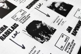
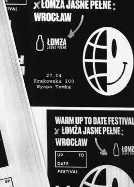
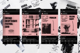
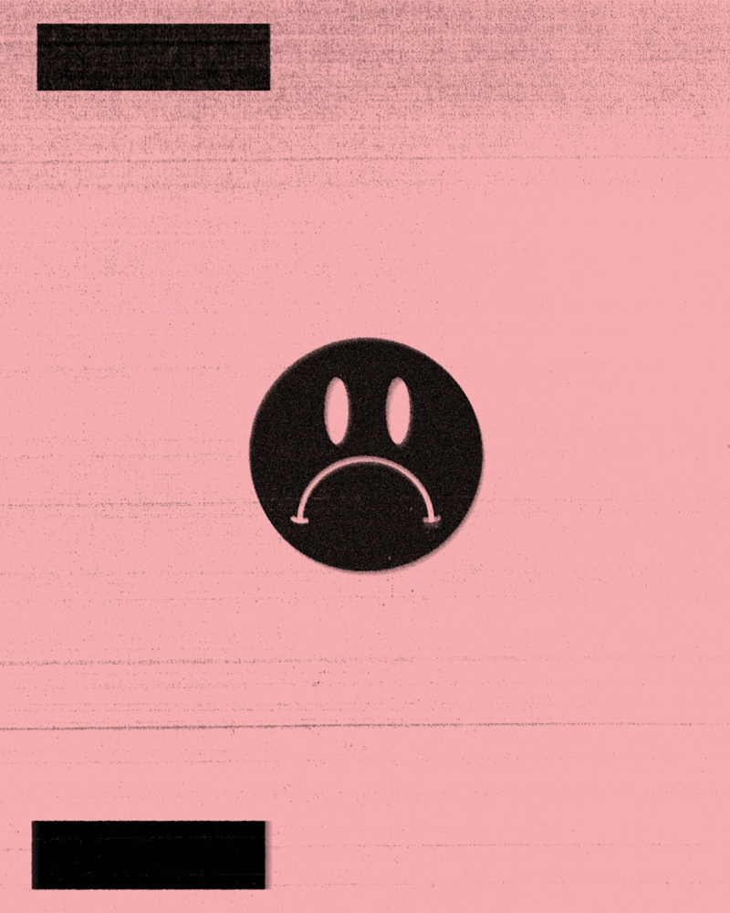
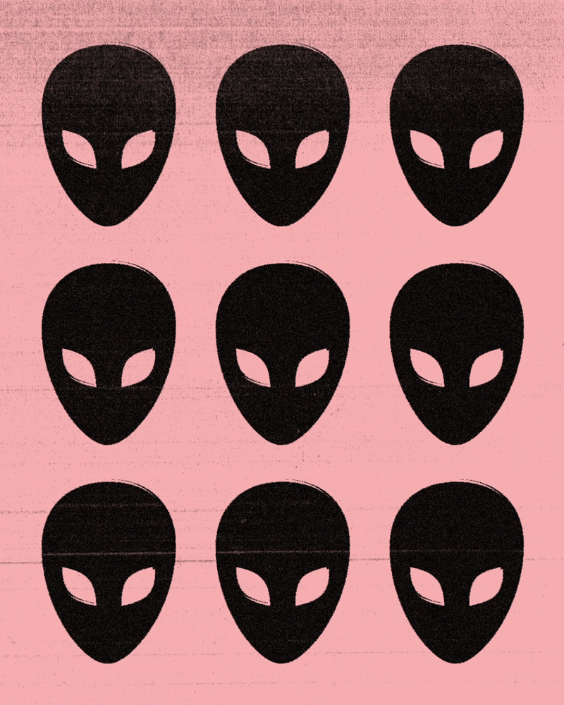
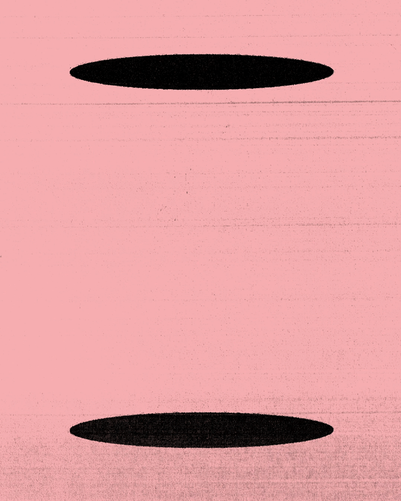
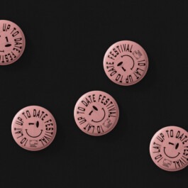
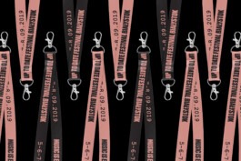
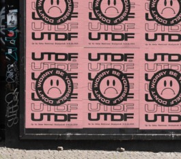
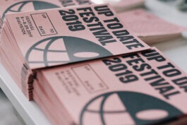
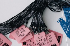
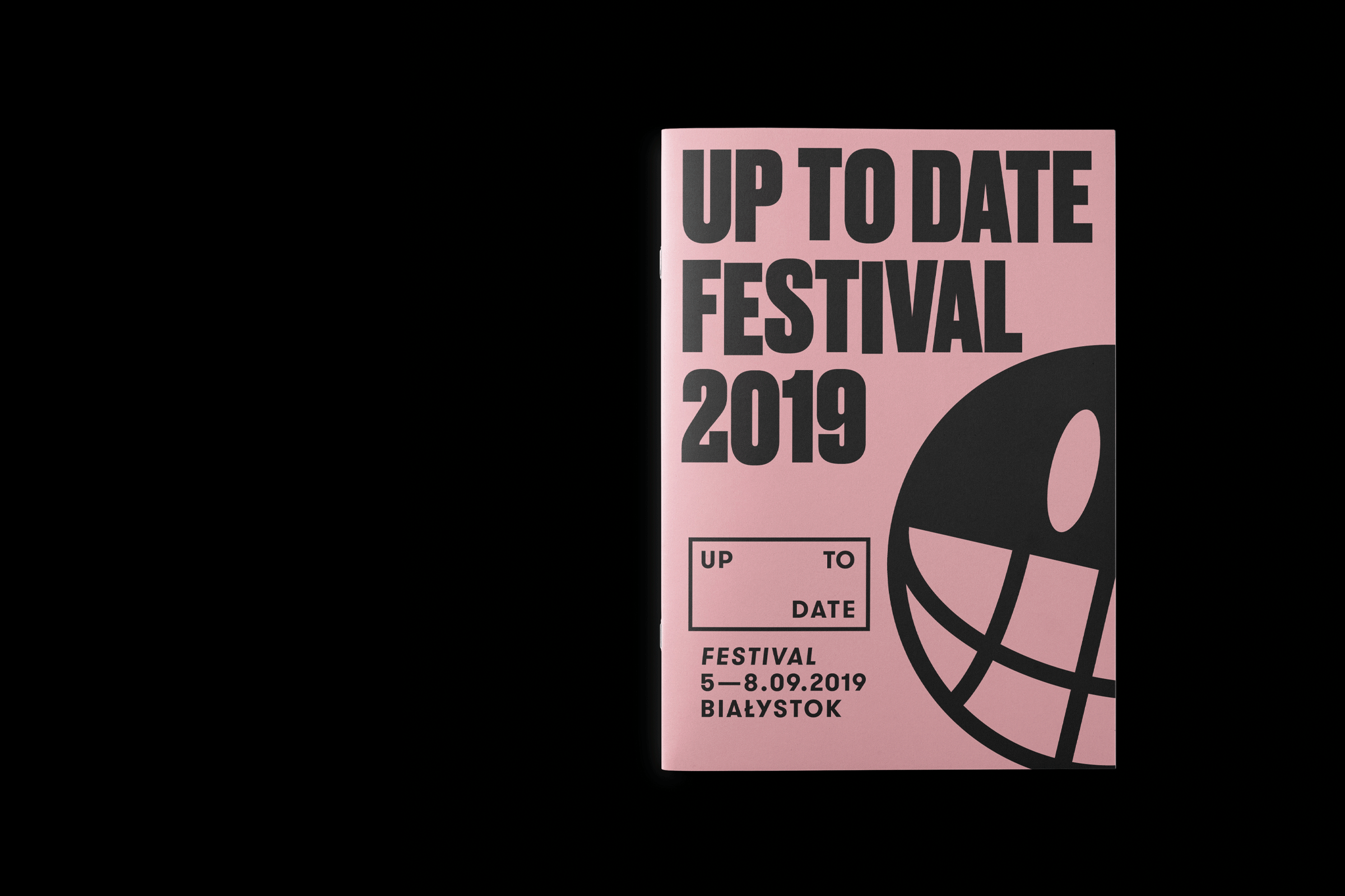
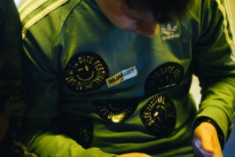
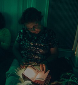
Like last year, the visual identity is based on handmade aesthetics, which gives the event a distinctive, personal touch. Unlike the 2018 edition, the 2019 aesthetics goes a step further with the impression of amateurish quality.
Year
2019
Scope
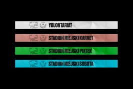
Brand design, collateral, copywriting, corporate & verbal identity, outdoor, print design, signage & wayfinding.
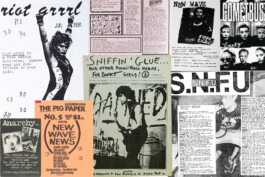
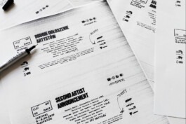
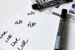
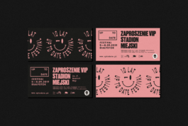
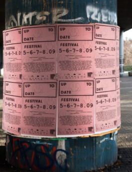
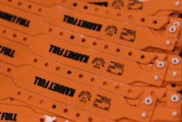
The process of creating the brand materials was very laborious. After designing, most of the elements had to be photocopied and scanned several times to obtain the characteristic background effect. Also, we had to add handwritten notes. In the case of alterations in the design, we had to redo the whole process. This method of work is incomparably more time-consuming than the standard one.
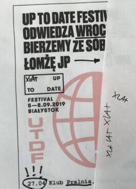
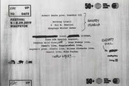
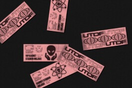
The characteristic pink paper used in the materials was widely used in copy-shops more than two decades ago. The feeling of nostalgia serves the festival's brand very well.
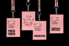
Typography, like the rest of the elements, was inspired by the typewriter typical of punk zines of the 70s and 80s. Handwritten notes, corrections and cross-outs reflect the authenticity of the materials and intensify the sense of nostalgia.


Visual Identity: Grzegorz Sołowiński
Motion design: Jarosław Dziubek
Year
2019
Scope
Brand design, collateral, copywriting, corporate & verbal identity, outdoor, print design, signage & wayfinding.
Up to Date is the most awarded music festival in Białystok, Poland. The repertoire consists mainly of hip-hop and electronic music, addressed to many audiences - both younger and older. The organisers' mission is not only to unite generations but also to break stereotypes related to techno music, which is to be helped by their original project Pozdro Techno Sound System.
Like last year, the visual identity is based on handmade aesthetics, which gives the event a distinctive, personal touch. Unlike the 2018 edition, the 2019 aesthetics goes a step further with the impression of amateurish quality.
The process of creating the brand materials was very laborious. After designing, most of the elements had to be photocopied and scanned several times to obtain the characteristic background effect. Also, we had to add handwritten notes. In the case of alterations in the design, we had to redo the whole process. This method of work is incomparably more time-consuming than the standard one.
The characteristic pink paper used in the materials was widely used in copy-shops more than two decades ago. The feeling of nostalgia serves the festival's brand very well.
Typography, like the rest of the elements, was inspired by the typewriter typical of punk zines of the 70s and 80s. Handwritten notes, corrections and cross-outs reflect the authenticity of the materials and intensify the sense of nostalgia.
Visual Identity: Grzegorz Sołowiński
Motion design: Jarosław Dziubek