VZOR is a renown furniture manufacturer of the iconic, historical designs of Roman Modzelewski and Czesław Knothe. It offers selected chairs and armchairs from the 1950s, which could be admired, until recently, only in museums and galleries. In their offer, VZOR focuses primarily on designers, only later - their work. This portfolio policy stands in opposition to other companies that offer "everything for everyone".
With the branding, we aim to adapt the language of visual communication to the design of legendary artists. Thanks to this, we maintain consistency between the message and the product, which consequently makes the brand authentic.
However, the identity has not been implemented.
Year
2014
Scope
Branding, collateral, corporate identity, print design, packaging design.

has been almost forgotten and not available for sale. Due to its design and being the first seat in the world made in a homogeneous form, it appeared only as an exhibit at the Victoria & Albert Museum in London. The founders of VZOR contacted the widow of Modzelewski, in the hope that they would purchase a production license from her. It worked, thanks to which they resurrected the legend of Polish design according to the original project from 1958.

The logotype typography we designed is based on oval forms referring to the brand's flagship product - the RM58 armchair by Roman Modzelewski. The specific gaps in the letters make the logotype lighter, at the same time referring to the lightness typical for VZOR furniture.


– broken white, dirty red, softened brown, black. We have tried to reproduce the spirit of the turn of the century accurately, and the colour is one of the best tools to achieve that authenticity.


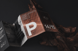
We chose to emphasize their uniqueness by designing clean layouts and using light typography, referring in shape to the presented design.


being the first letter of the logotype. The classic grotesque typeface we modified refers to the classic form of the western trends in design from the beginning of the second half of the 20th century. Also, the modification of typography is original enough to find itself comfortably in the present reality.


Visual Identity: Adrian Spóz, Natalia Bilska
Year
2014
Scope
Branding, collateral, corporate identity, print design, packaging design.
VZOR is a renown furniture manufacturer of the iconic, historical designs of Roman Modzelewski and Czesław Knothe. It offers selected chairs and armchairs from the 1950s, which could be admired, until recently, only in museums and galleries. In their offer, VZOR focuses primarily on designers, only later - their work. This portfolio policy stands in opposition to other companies that offer "everything for everyone".
With the branding, we aim to adapt the language of visual communication to the design of legendary artists. Thanks to this, we maintain consistency between the message and the product, which consequently makes the brand authentic.
However, the identity has not been implemented.
has been almost forgotten and not available for sale. Due to its design and being the first seat in the world made in a homogeneous form, it appeared only as an exhibit at the Victoria & Albert Museum in London. The founders of VZOR contacted the widow of Modzelewski, in the hope that they would purchase a production license from her. It worked, thanks to which they resurrected the legend of Polish design according to the original project from 1958.
The logotype typography we designed is based on oval forms referring to the brand's flagship product - the RM58 armchair by Roman Modzelewski. The specific gaps in the letters make the logotype lighter, at the same time referring to the lightness typical for VZOR furniture.
– broken white, dirty red, softened brown, black. We have tried to reproduce the spirit of the turn of the century accurately, and the colour is one of the best tools to achieve that authenticity.
We chose to emphasize their uniqueness by designing clean layouts and using light typography, referring in shape to the presented design.
being the first letter of the logotype. The classic grotesque typeface we modified refers to the classic form of the western trends in design from the beginning of the second half of the 20th century. Also, the modification of typography is original enough to find itself comfortably in the present reality.
Visual Identity: Adrian Spóz, Natalia Bilska