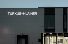
Turkus+Lainer is a Polish manufacturer of industrial flooring systems providing solutions for factories, warehouses, car parks, retail spaces etc. Originally two separate companies (Lainer and Turkus) were combined into one brand, for which we prepared the concept, language and corporate visual identity system.
Year
2021
Scope
Brand design, promotional materials, web design, corporate identity, collateral, verbal identity, copywriting, print media, packaging, pictograms, social media.

The first task was to define the nature of the brand and choose a name. The naming had to build the company's reputation in the international arena with its form and sound and strengthen the morale of the combined crews. Another interesting issue was how salespeople could pronounce the name during telephone conversations with potential clients.

We have stayed with the proud sound of both elements, which we have combined with a plus. Starting with 'Turkus' also makes the brand easier to pronounce.


Instead of focusing on the offer, we focused on creating the impression that the manufacturer understands the priorities of its customers and speaks the language of business, not the product. Turkus+Lainer has thus become a symbol of business success - whether for investors, contractors or architects.


Visually we presented the brand as uncommonly modern and based on knowledge and technology. Instead of clunkiness, we opted for technicality; instead of the image of a builder, we chose the image of a technician, specialist, or even a scientist.
The typography and colour scheme move away from the heavy, sometimes backward connotations close to the conservative industry. We build technological grandeur and a sense of business development.


Jakub Ułanowicz
CEO, TURKUS+LAINER

→ PGD Awards, Visual Identity/Rebranding, Main Prize — 2022
Visual identity: Natalia Bilska
Project Manager: Marta Pawlaczyk
UX design: Katarzyna Słowik
UI design: Natalia Bilska
Photography: Barbara Kwiatkowska

Year
2021
Scope
Brand design, promotional materials, web design, corporate identity, collateral, verbal identity, copywriting, print media, packaging, pictograms, social media.

Turkus+Lainer is a Polish manufacturer of industrial flooring systems providing solutions for factories, warehouses, car parks, retail spaces etc. Originally two separate companies (Lainer and Turkus) were combined into one brand, for which we prepared the concept, language and corporate visual identity system.

The first task was to define the nature of the brand and choose a name. The naming had to build the company's reputation in the international arena with its form and sound and strengthen the morale of the combined crews. Another interesting issue was how salespeople could pronounce the name during telephone conversations with potential clients.
We have stayed with the proud sound of both elements, which we have combined with a plus. Starting with 'Turkus' also makes the brand easier to pronounce.


Instead of focusing on the offer, we focused on creating the impression that the manufacturer understands the priorities of its customers and speaks the language of business, not the product. Turkus+Lainer has thus become a symbol of business success - whether for investors, contractors or architects.


Visually we presented the brand as uncommonly modern and based on knowledge and technology. Instead of clunkiness, we opted for technicality; instead of the image of a builder, we chose the image of a technician, specialist, or even a scientist.
The typography and colour scheme move away from the heavy, sometimes backward connotations close to the conservative industry. We build technological grandeur and a sense of business development.


Jakub Ułanowicz
CEO, TURKUS+LAINER

→ PGD Awards, Visual Identity/Rebranding, Main Prize — 2022
Visual identity: Natalia Bilska
Project Manager: Marta Pawlaczyk
UX design: Katarzyna Słowik
UI design: Natalia Bilska
Photography: Barbara Kwiatkowska