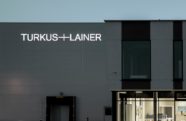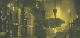
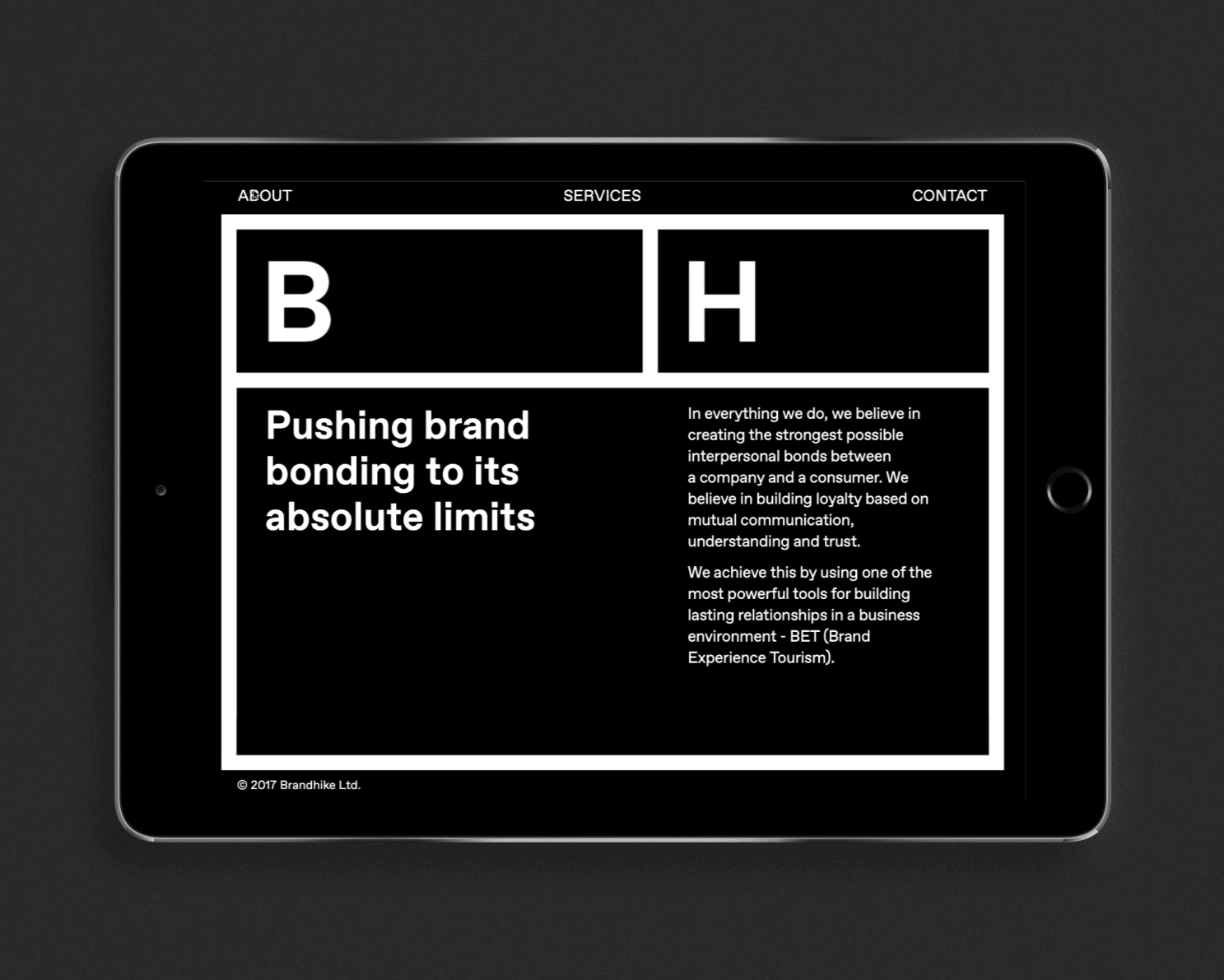
Brandhike corporate identity remains one of the most challenging projects we had the opportunity to face. The consulting agency is setting standards in a very difficult to define marketing niche – industrial tourism. This itself is a challenge when building a clear metaphor for the basics of visual communication. Their leading target group is a business client with a considerable investment portfolio. The end-user, on the other hand – an individual customer in the age range from the elderly to children.
Year
2017
Scope
Branding, collateral, corporate identity, print design, copywriting, web design.
Marius Geddes
CEO, Brandhike

which – because of its comprehensiveness – makes it troublesome to find a common denominator. The audit, training and consulting are addressed to several very different corporate fields: CSR, human resources, public relations, sales and production.
connecting these two concepts into one coherent message. We adopted the symbolism of trail signage, with a very functional, reliable, orderly framework. Their image also evokes associations with adventure and curiosity.
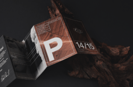
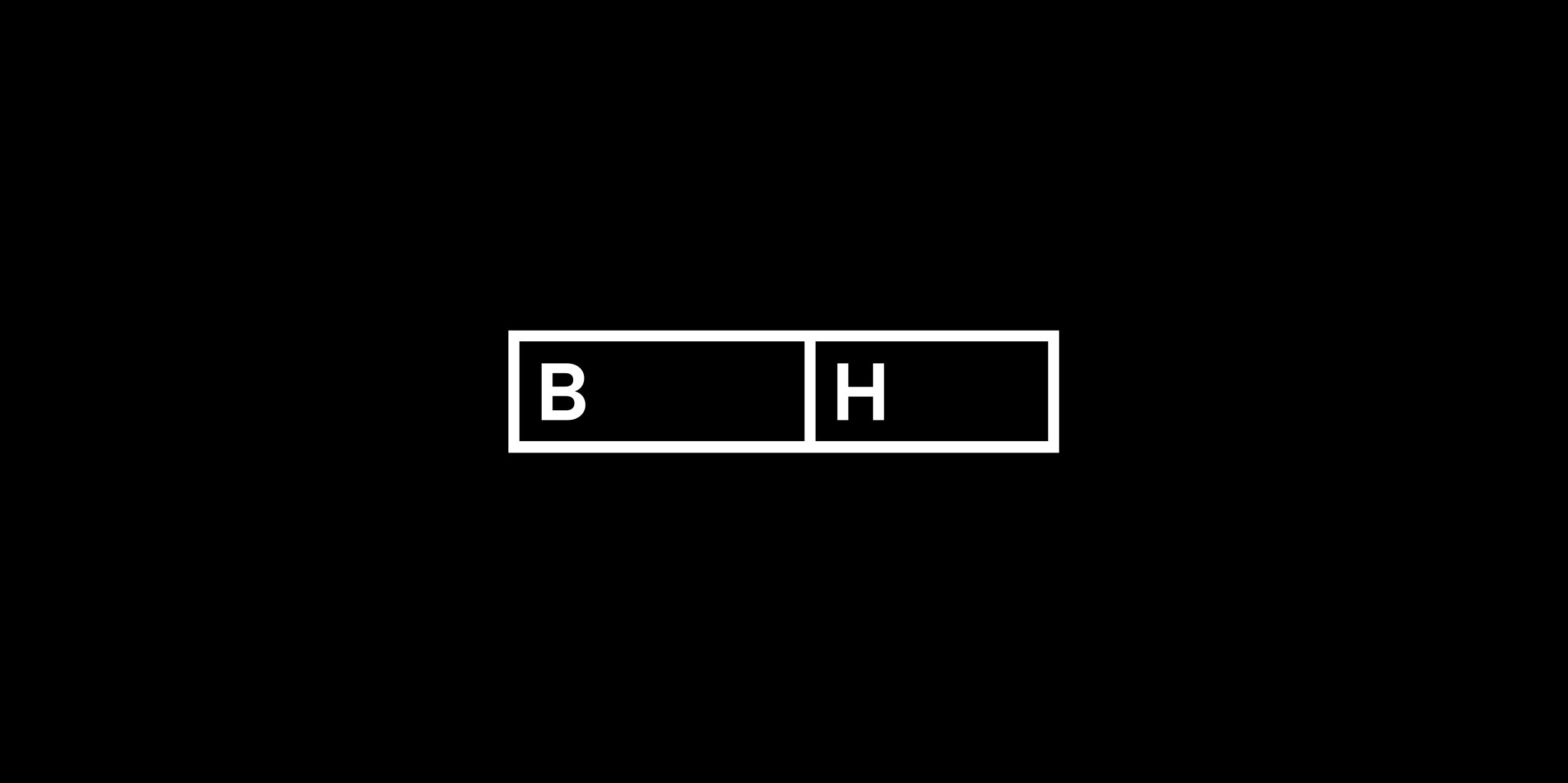
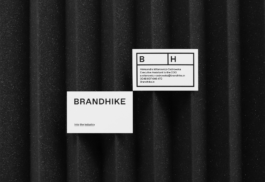
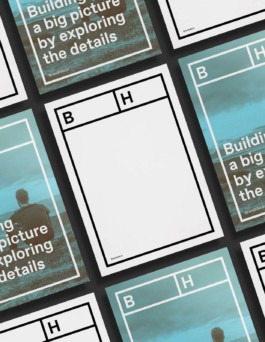
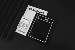
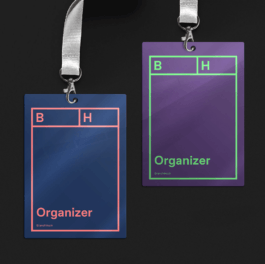
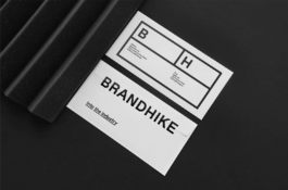
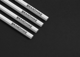
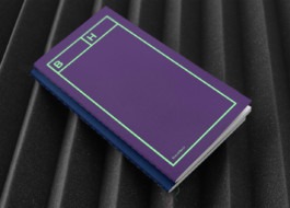
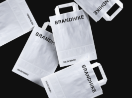
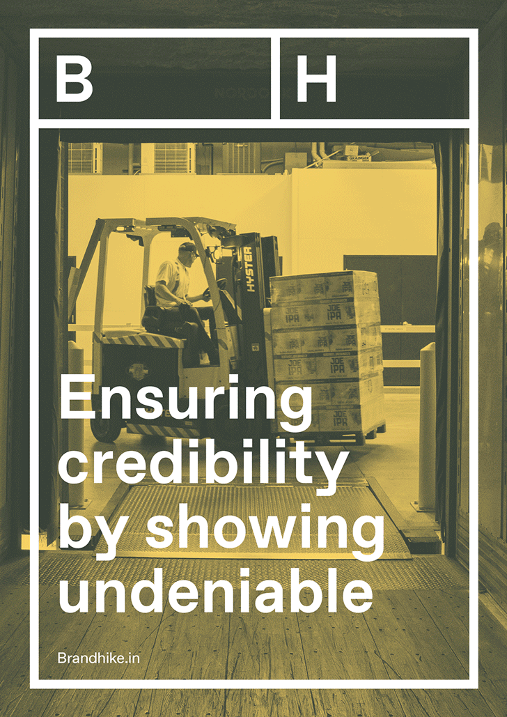
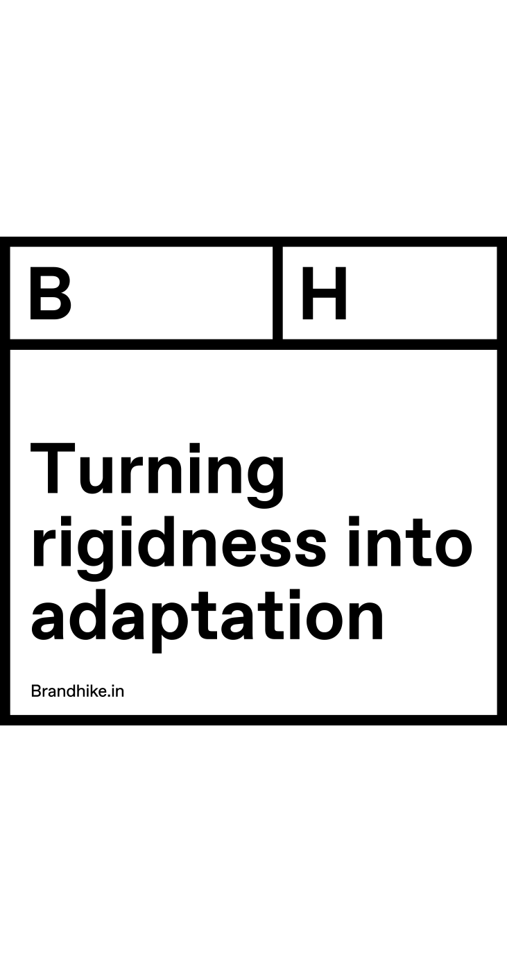
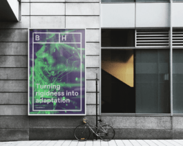
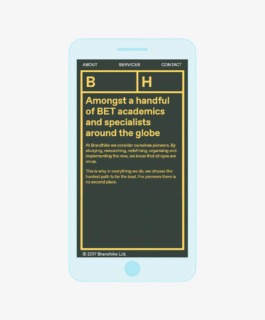
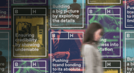
The brand’s name written in capital letters is the best fit for this logotype. Clear and solid it distinctly represents the professional transparency standing behind the company’s philosophy. The separately used symbol is built from “B” and “H” in a frame, which sets a clear boundary between the aspect of business and tourism.

— was created by the Swiss type foundry, Dinamo. It is simplistic, visually compelling, easy to read and has some subtle twists in its design, making it a perfect fit for Brandhike. One of the many characteristics is the capital letter “R”, which notably and firmly “stands on its own two feet”, or the letter “y”, securely positioned on the ground. Coincidentally, works on the font and Brandhike took place simultaneously, so to use the typography, we had to contact its authors.
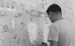
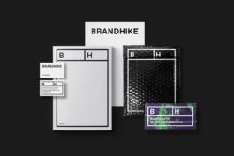
Adapting the brand symbol to the diversity of applied media was a time-consuming and technically complicated process. The challenge was to maintain the proportions of the logo frame (unchangeable in principle) in a different context. We had to design each template separately for all possible screen resolutions.


Strategy: Maciej Frymus
Visual Identity: Grzegorz Sołowiński
Year
2017
Scope
Branding, collateral, corporate identity, print design, copywriting, web design.
Brandhike corporate identity remains one of the most challenging projects we had the opportunity to face. The consulting agency is setting standards in a very difficult to define marketing niche – industrial tourism. This itself is a challenge when building a clear metaphor for the basics of visual communication. Their leading target group is a business client with a considerable investment portfolio. The end-user, on the other hand – an individual customer in the age range from the elderly to children.
Marius Geddes
CEO, Brandhike
which – because of its comprehensiveness – makes it troublesome to find a common denominator. The audit, training and consulting are addressed to several very different corporate fields: CSR, human resources, public relations, sales and production.
connecting these two concepts into one coherent message. We adopted the symbolism of trail signage, with a very functional, reliable, orderly framework. Their image also evokes associations with adventure and curiosity.
The brand’s name written in capital letters is the best fit for this logotype. Clear and solid it distinctly represents the professional transparency standing behind the company’s philosophy. The separately used symbol is built from “B” and “H” in a frame, which sets a clear boundary between the aspect of business and tourism.
— was created by the Swiss type foundry, Dinamo. It is simplistic, visually compelling, easy to read and has some subtle twists in its design, making it a perfect fit for Brandhike. One of the many characteristics is the capital letter “R”, which notably and firmly “stands on its own two feet”, or the letter “y”, securely positioned on the ground. Coincidentally, works on the font and Brandhike took place simultaneously, so to use the typography, we had to contact its authors.
Adapting the brand symbol to the diversity of applied media was a time-consuming and technically complicated process. The challenge was to maintain the proportions of the logo frame (unchangeable in principle) in a different context. We had to design each template separately for all possible screen resolutions.
Strategy: Maciej Frymus
Visual Identity: Grzegorz Sołowiński