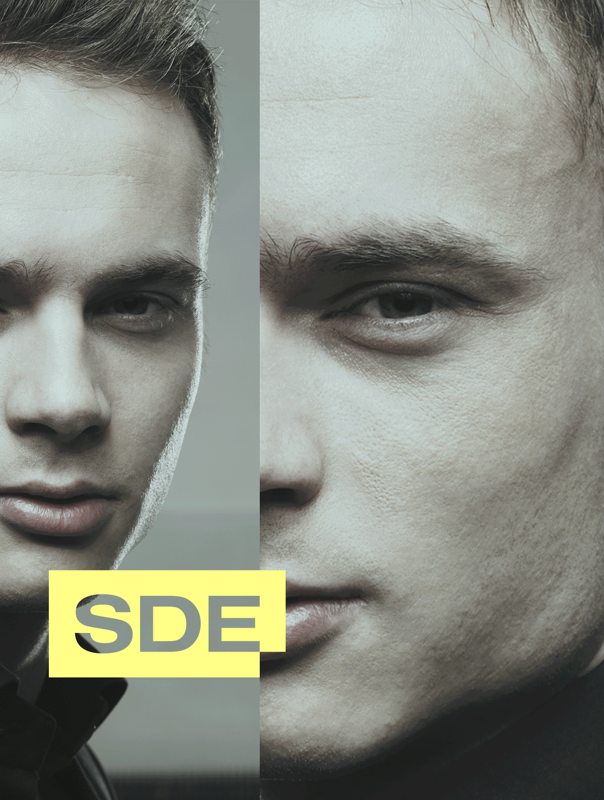
SDE is a media and events agency working for the biggest clients and celebrities. The brand behind the best events. Our task was to create a branding that would neatly define the company’s profile and the role in the market.
Year
2015
Scope
Branding, collateral, corporate identity, print design, social media, web design.


like the letterhead, business cards, notebook etc. The posters also underwent treatment where one image is behind another, and the logo is shuffled in between, uniting significant elements.


The widened font stands firmly and adds visual stability. It is essential to portray the company as reliable and trustworthy since SDE’s events affect their clients’ reputation. Black and white are the primary colours that minimise the visual clutter and picture the brand as professional, especially with the substantial black background. The more vibrant palette comes in only when there is a need for enhancing specific emotional imagery.


We avoided the clutter; every element of the website or other materials have been designated, visible, and in an easy to find place. The logo – even though surrounded by imagery – is very distinctive and grabs the attention fast. This is how we wanted the brand to be seen – seemingly inconspicuous, and yet very confident with a crucial role to play.


Strategy: Adrian Spóz
Visual Identity: Adrian Spóz, Grzegorz Sołowiński
Project Manager: Adrian Spóz
Year
2015
Scope
Branding, collateral, corporate identity, print design, social media, web design.
SDE is a media and events agency working for the biggest clients and celebrities. The brand behind the best events. Our task was to create a branding that would neatly define the company’s profile and the role in the market.
like the letterhead, business cards, notebook etc. The posters also underwent treatment where one image is behind another, and the logo is shuffled in between, uniting significant elements.
The widened font stands firmly and adds visual stability. It is essential to portray the company as reliable and trustworthy since SDE’s events affect their clients’ reputation. Black and white are the primary colours that minimise the visual clutter and picture the brand as professional, especially with the substantial black background. The more vibrant palette comes in only when there is a need for enhancing specific emotional imagery.
We avoided the clutter; every element of the website or other materials have been designated, visible, and in an easy to find place. The logo – even though surrounded by imagery – is very distinctive and grabs the attention fast. This is how we wanted the brand to be seen – seemingly inconspicuous, and yet very confident with a crucial role to play.
Strategy: Adrian Spóz
Visual Identity: Adrian Spóz, Grzegorz Sołowiński
Project Manager: Adrian Spóz