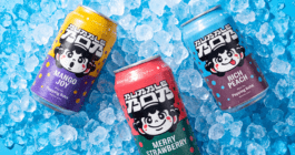
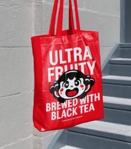
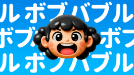
Bubble Bob is a ready to drink bubble tea made with black tea, natural fruit juice and popping pearls. Created for Gladio Group, the brand turns a familiar drink format into a loud, character driven world built around Bob, a mascot, logo and troublemaker in one.
Designed to stand out in a crowded category, Bubble Bob combines Asian pop inspired visuals, saturated colours, bold packaging and a sharp verbal identity. What started as a product for bars and restaurants quickly expanded into major retail chains, vending machines and international markets, becoming one of Gladio Group’s leading brands.
Year
2025
Scope
→ Brand strategy
→ Brand design
→ Packaging design
→ Copywriting
→ Visual communication guidelines
→ Social media communication schemes

Bubble Bob entered a category already full of colour, flavour and visual noise. The challenge was to make bubble tea feel new again, not only as a drink, but as a character driven brand with instant shelf impact.
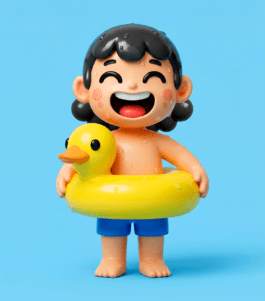
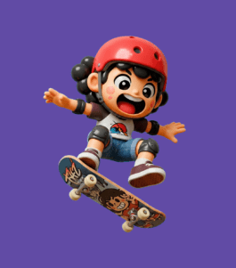
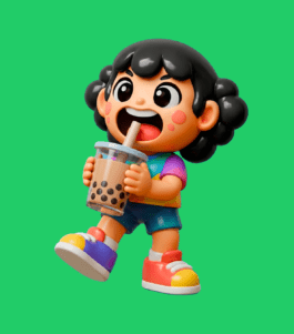
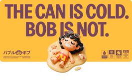
At the centre of the system is Bob. He gives the product a face, a voice and a reason to behave differently. Cute, loud and slightly strange, Bob turns every can into a small pop culture object.

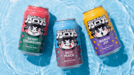
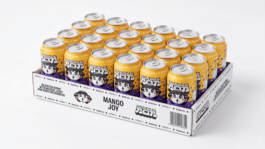
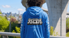
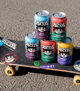
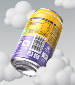
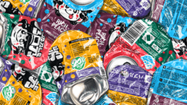
The can became the main stage for the brand. It had to explain the product, introduce Bob, differentiate flavours and create desire from a distance.
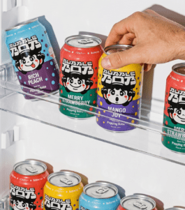
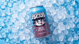
Each flavour has its own colour palette and its own expression of Bob, making the range feel collectible and instantly recognisable. Rich Peach, Merry Strawberry and Mango Joy are not just variants. They are moods.
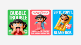
Bubble Bob’s language is short, loud and playful. Less like classic beverage copy, more like a warning sign from a cartoon world. Lines such as Sip it. Pop it. Blame Bob., Next stop your mouth and Move over Bob is coming make the brand voice part of the experience. The copy does not explain the fun. It starts it.
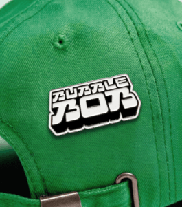
The identity draws from Asian pop culture, toy design, manga energy and convenience store aesthetics. It is bright, direct and deliberately over the top, but never random.
The logo, character, colours and popping pearl motifs create a world that feels fast, physical and full of movement. Bubble Bob does not whisper from the shelf. It jumps.
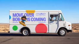
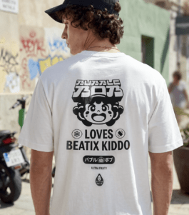
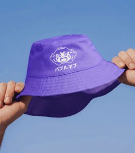
From the beginning, Bubble Bob was designed to live beyond a single product. The system can stretch naturally into social media, POS, merchandise, delivery vehicles, vending machines, bubble tea bars and DIY kits.
Bob is not a decoration. He is the engine of the brand, carrying the same mix of cuteness, chaos and pop energy wherever the product goes.
Bubble Bob quickly grew beyond its original assumptions. Planned for bars and restaurants, it moved into major retail chains, school vending machines and international markets.
The result is a drink with black tea, natural juice and popping pearls, but also something more memorable: a tiny chaos in a can, led by a character young audiences made their own.
Brand Design:
Adrian Spóz
Maria Demianiuk
Strategy & Copywriting:
Łukasz Słotwiński
Adrian Spóz
Motion Design:
Maria Demianiuk
Project Management:
Agata Sędzikowska


Silver KTR 2025 - Packaging
Bronze KTR 2025 - Brand Identity Systems
Silver NAPA 2025
Year
2025
Scope
→ Brand strategy
→ Brand design
→ Packaging design
→ Copywriting
→ Visual communication guidelines
→ Social media communication schemes
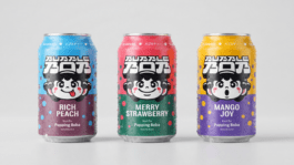
Bubble Bob is a ready to drink bubble tea made with black tea, natural fruit juice and popping pearls. Created for Gladio Group, the brand turns a familiar drink format into a loud, character driven world built around Bob, a mascot, logo and troublemaker in one.
Designed to stand out in a crowded category, Bubble Bob combines Asian pop inspired visuals, saturated colours, bold packaging and a sharp verbal identity. What started as a product for bars and restaurants quickly expanded into major retail chains, vending machines and international markets, becoming one of Gladio Group’s leading brands.
Bubble Bob entered a category already full of colour, flavour and visual noise. The challenge was to make bubble tea feel new again, not only as a drink, but as a character driven brand with instant shelf impact.
At the centre of the system is Bob. He gives the product a face, a voice and a reason to behave differently. Cute, loud and slightly strange, Bob turns every can into a small pop culture object.
The can became the main stage for the brand. It had to explain the product, introduce Bob, differentiate flavours and create desire from a distance.
Each flavour has its own colour palette and its own expression of Bob, making the range feel collectible and instantly recognisable. Rich Peach, Merry Strawberry and Mango Joy are not just variants. They are moods.
Bubble Bob’s language is short, loud and playful. Less like classic beverage copy, more like a warning sign from a cartoon world. Lines such as Sip it. Pop it. Blame Bob., Next stop your mouth and Move over Bob is coming make the brand voice part of the experience. The copy does not explain the fun. It starts it.
The identity draws from Asian pop culture, toy design, manga energy and convenience store aesthetics. It is bright, direct and deliberately over the top, but never random.
The logo, character, colours and popping pearl motifs create a world that feels fast, physical and full of movement. Bubble Bob does not whisper from the shelf. It jumps.
From the beginning, Bubble Bob was designed to live beyond a single product. The system can stretch naturally into social media, POS, merchandise, delivery vehicles, vending machines, bubble tea bars and DIY kits.
Bob is not a decoration. He is the engine of the brand, carrying the same mix of cuteness, chaos and pop energy wherever the product goes.
Bubble Bob quickly grew beyond its original assumptions. Planned for bars and restaurants, it moved into major retail chains, school vending machines and international markets.
The result is a drink with black tea, natural juice and popping pearls, but also something more memorable: a tiny chaos in a can, led by a character young audiences made their own.
Brand Design:
Adrian Spóz
Maria Demianiuk
Strategy & Copywriting:
Łukasz Słotwiński
Adrian Spóz
Motion Design:
Maria Demianiuk
Project Management:
Agata Sędzikowska
Silver KTR 2025 - Packaging
Bronze KTR 2025 - Brand Identity Systems
Silver NAPA 2025