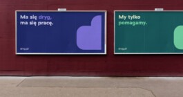
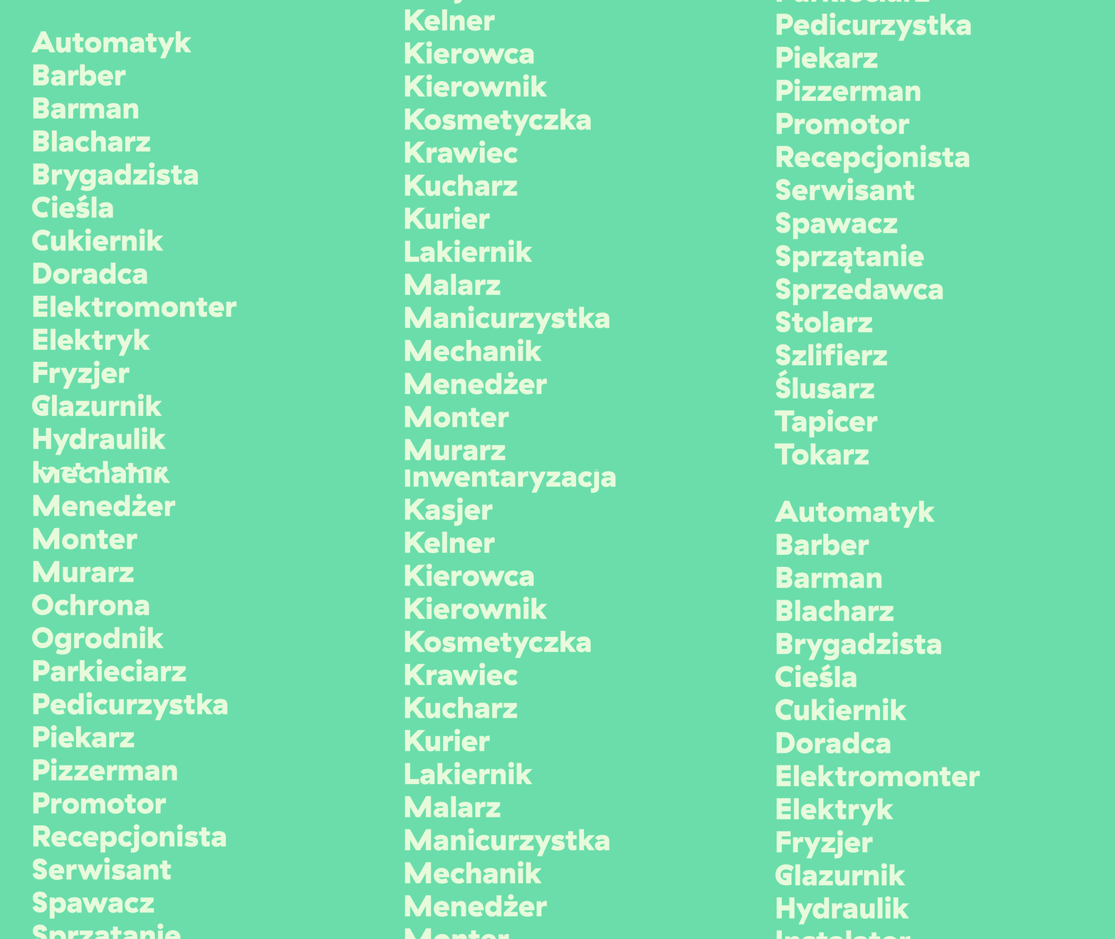
Grupa Pracuj, for whom we have already created two brands, approached us with a project for a new job search website for blue collars - suppliers, salespeople, warehouse workers, construction workers, drivers, operators, etc. Our task was to create a complete brand from the name and communication strategy to the entire visual identity system.
We started with the name "Dryg", which means “knack” (for something).
Year
2020 – 2021
Scope
Brand design, strategy, website design, collateral, naming, copywriting, corporate & verbal identity, outdoor, print design, illustrations, brand manual.

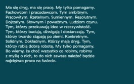
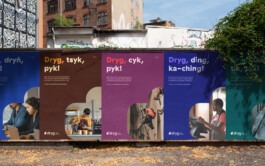
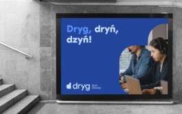
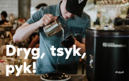
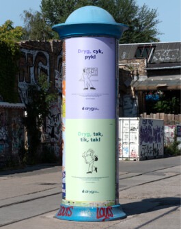
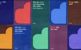
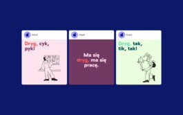
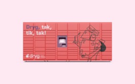
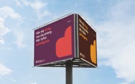
We aim our slogans at young people. In this way, we give meaning and character to a name that might seem archaic to them. For example, "dryg, tsyk, pyk" (tssk, knock) fit baristas, "dryg, dryń, dzyń" (brrinng, brrinng) – telemarketers.
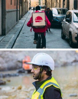
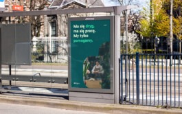
"Dryg in the phone is a job in the pocket" is a slogan for more senior professionals, often reluctant to use mobile solutions. We try to encourage them to use the Dryg application.
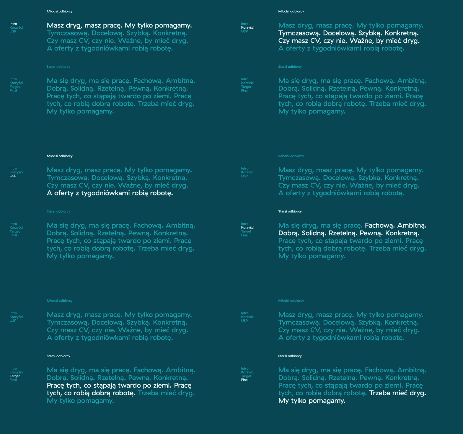
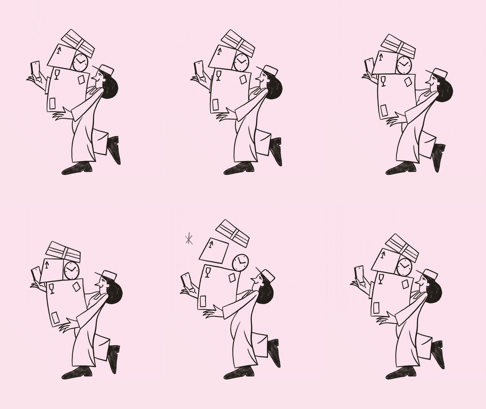
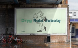
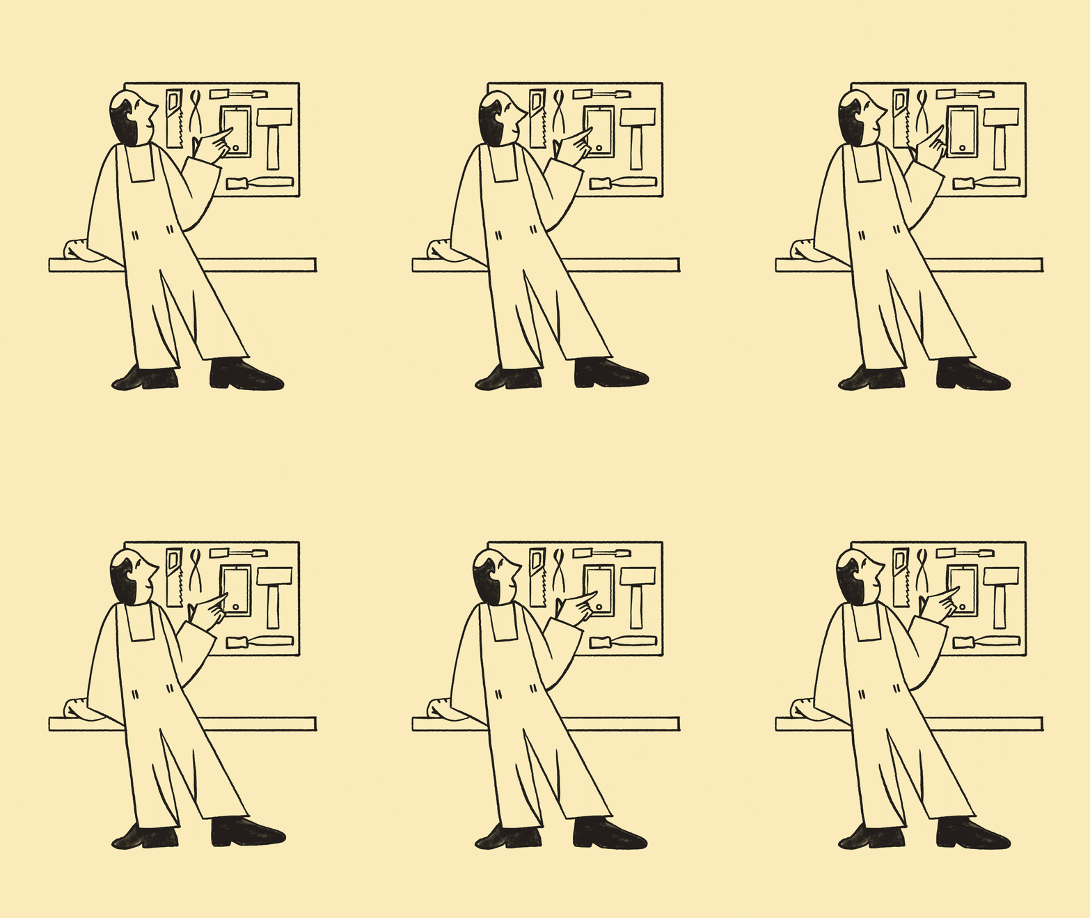
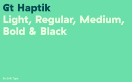
We chose the typography to be as readable as possible (especially on mobile devices) and to be friendly, welcoming, and accessible. We wanted the maximum number of users to feel welcome on the website.

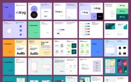
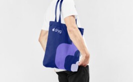
We prepared an extensive brand manual with guidelines for the logo, typography, colours, photos, illustrations, communication rules and more. All this makes it easier to use the designed materials and maintain the project's quality.

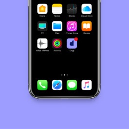
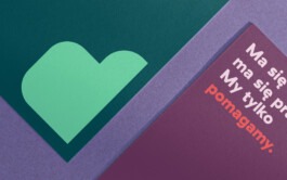
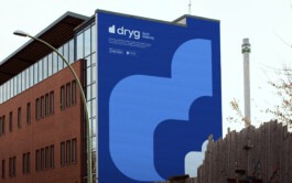
The icon in the logo symbolises the letter D and the thumbs-up. It is simple, distinctive, straightforward and easy to remember. Minimum form and maximum content.


Sebastian Jabłonowski
Product Manager, Dryg.pl
Visual identity: Jarek Dziubek
Animations: Vlad Boyko
Illustrations: Michał Loba

Year
2020 – 2021
Scope
Brand design, strategy, website design, collateral, naming, copywriting, corporate & verbal identity, outdoor, print design, illustrations, brand manual.
Grupa Pracuj, for whom we have already created two brands, approached us with a project for a new job search website for blue collars - suppliers, salespeople, warehouse workers, construction workers, drivers, operators, etc. Our task was to create a complete brand from the name and communication strategy to the entire visual identity system.
We started with the name "Dryg", which means “knack” (for something).


We aim our slogans at young people. In this way, we give meaning and character to a name that might seem archaic to them. For example, "dryg, tsyk, pyk" (tssk, knock) fit baristas, "dryg, dryń, dzyń" (brrinng, brrinng) – telemarketers.


"Dryg in the phone is a job in the pocket" is a slogan for more senior professionals, often reluctant to use mobile solutions. We try to encourage them to use the Dryg application.


We chose the typography to be as readable as possible (especially on mobile devices) and to be friendly, welcoming, and accessible. We wanted the maximum number of users to feel welcome on the website.


We prepared an extensive brand manual with guidelines for the logo, typography, colours, photos, illustrations, communication rules and more. All this makes it easier to use the designed materials and maintain the project's quality.

The icon in the logo symbolises the letter D and the thumbs-up. It is simple, distinctive, straightforward and easy to remember. Minimum form and maximum content.


Sebastian Jabłonowski
Product Manager, Dryg.pl
Visual identity: Jarek Dziubek
Animations: Vlad Boyko
Illustrations: Michał Loba