

For more than 70 years, Elektromontaż Lublin has allowed energy to be supplied to people for work, living, and development. Therefore, its new identity assumes a clear and contemporary form, which reflects their mission and values.
Year
2026
Scope
→ Visual Identity
→ Copywriting
→ Visual communication guidelines
→ Social media communication schemes
We built the new look of Elektromontaż Lublin around our core strengths: energy, clarity, and technical precision.
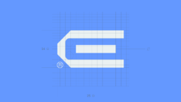
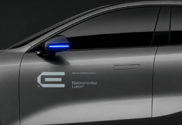
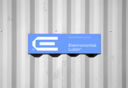
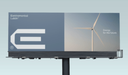
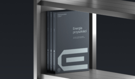
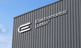
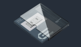
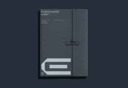
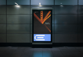
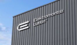
The logo serves as a key pillar of our design language - distinctive, instantly recognizable, and strong. Paired with simple layouts and clean imagery, our branding cuts through the clutter to highlight what truly counts: performance and quality.
This is a functional identity built for the everyday: in the field, across industry, and everywhere power makes a difference.
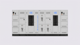
Elektromontaż Lublin integrates design, engineering, production, and execution under one roof - from blueprint to completion. Our updated color scheme mirrors this expertise:
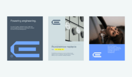
→ Blue represents the sky and bold future ambitions.
→ Shades of gray and graphite reflect technical precision and the durability of steel.
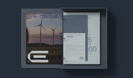
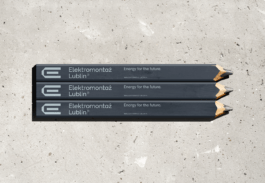
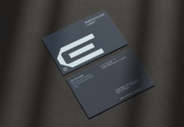
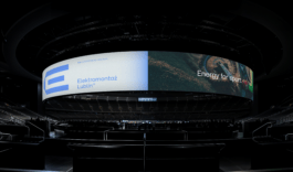
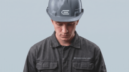
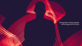
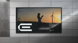
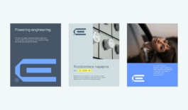
Our new communication style organizes what matters most to the brand: the future, people, and engineering.
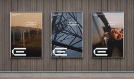
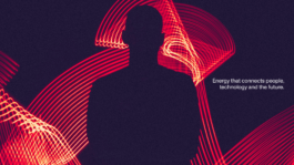
Energy for the future. Energy for people. Energy for engineering.
These three directions speak to responsible development, the energy required every day, and the expertise that keeps infrastructure running reliably. It is a simpler, clearer way of saying who we are and where we are heading.
Brand Design:
Adrian Spóz
Marta Goździewicz
Jarosław Dziubek
Strategy & Copywriting:
Łukasz Słotwiński
Motion Design:
Maria Demianiuk
Project Management:
Łukasz Słotwiński
Agata Sędzikowska
The photographs of the devices are the property of Elektromontaż Lublin

Year
2026
Scope
→ Visual Identity
→ Copywriting
→ Visual communication guidelines
→ Social media communication schemes
For more than 70 years, Elektromontaż Lublin has allowed energy to be supplied to people for work, living, and development. Therefore, its new identity assumes a clear and contemporary form, which reflects their mission and values.
We built the new look of Elektromontaż Lublin around our core strengths: energy, clarity, and technical precision.
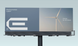
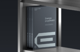
The logo serves as a key pillar of our design language - distinctive, instantly recognizable, and strong. Paired with simple layouts and clean imagery, our branding cuts through the clutter to highlight what truly counts: performance and quality.
This is a functional identity built for the everyday: in the field, across industry, and everywhere power makes a difference.
Elektromontaż Lublin integrates design, engineering, production, and execution under one roof - from blueprint to completion. Our updated color scheme mirrors this expertise:
→ Blue represents the sky and bold future ambitions.
→ Shades of gray and graphite reflect technical precision and the durability of steel.
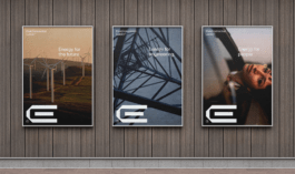
Our new communication style organizes what matters most to the brand: the future, people, and engineering.
Energy for the future. Energy for people. Energy for engineering.
These three directions speak to responsible development, the energy required every day, and the expertise that keeps infrastructure running reliably. It is a simpler, clearer way of saying who we are and where we are heading.
Brand Design:
Adrian Spóz
Marta Goździewicz
Jarosław Dziubek
Strategy & Copywriting:
Łukasz Słotwiński
Motion Design:
Maria Demianiuk
Project Management:
Łukasz Słotwiński
Agata Sędzikowska
The photographs of the devices are the property of Elektromontaż Lublin


