Emplo is a SaaS digital platform that brings together the entire human aspect of the company – social collaboration, employee development and performance management solutions. The idea originated with the need for making organisations a better workplace for freshly-recruited employees, as well as making the whole HR process shorter and less complicated.
Our task was to create the brand's personality and visual identity, and develop a strategy for emplo's communication. We focused on moving from depersonalising jargon of “tools” and “business” to more accurate: “people” and “talents”. We changed “Human Resources” to “Human Relations”. The metaphor for emplo was the caterpillar becoming a butterfly.
Year
2014
Scope
Branding, collateral, corporate identity, print design, social media, communication strategy, copywriting.

– employees, management board, managers and HR department. Both design and language had to meet the needs of all the users, while their expectations often differ, which was one of the most challenging problems to face.
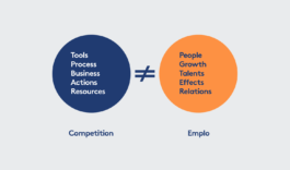
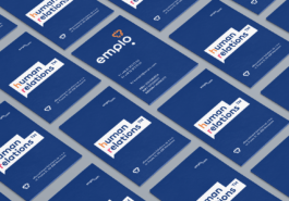
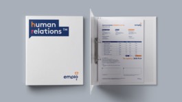
We translated “tools, processes, business, actions and resources” into “people, growth, talents, effects and relations”. This is how the “Human Relations” tagline came to be – a sort of manifesto underlining the human aspect of the system.

The roundness of the logo represents friendliness and equality. The symbol of a developing butterfly refers to the idea of growth, which is seen more as fragile and attractive than brutal and harsh.
Transforming into a butterfly is a metaphor referring to emplo activities and HR processes. Thanks to them, the employee has a chance to develop, spread the wings, become a better version of oneself.
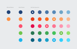
Brown is a very flexible font, with great proportions and geometry, working well with high-resolution media. The five colour palette works as a tool for employees, differentiating all brand elements and helping create a non-corporate feel.

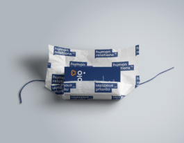
Emplo is a workplace communication tool. It simplifies the information flow, helps build relationships. The dialogue balloon – the symbol of conversation – is a flexible, spacious, distinctive way of communicating the core brand statements.
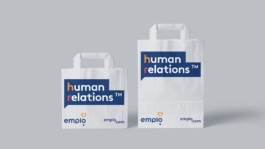
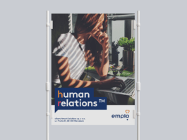
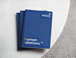
It was designed for use in marketing materials, documents, internal use as well as the software itself.

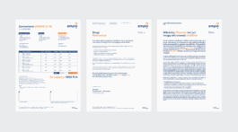
We have adapted the key visual to all possible tools used in the corporate environment. Each content material received a specially designed template. Our work included elements for the Microsoft Office suite and e-books, including .doc and .ppt documents, reports, charts, diagrams, infographics and more.
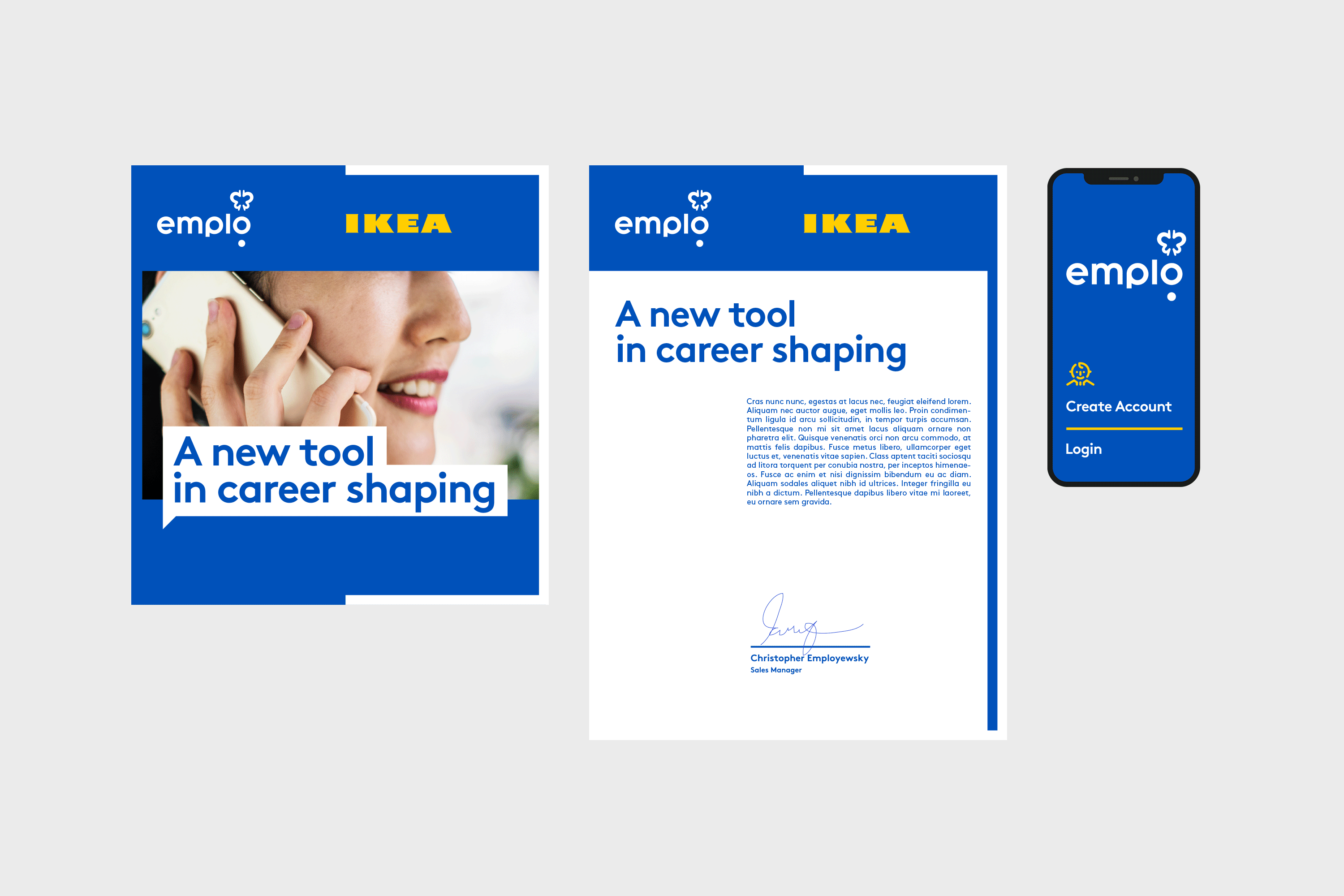
so to adapt to emplo’s corporate clients’ branding, as the software allows to use own templates leaving only the logo or platform’s name. Making the combination of different styles aesthetic and safe for both brands was essential.
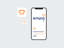
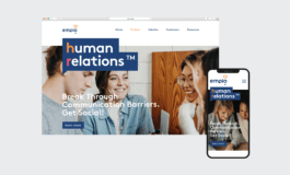
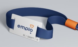
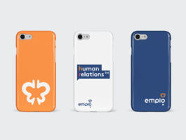
Thus emplo’s audience works mostly in digital. We've designed the corporate identity that is universal and perfectly adapted to the specifics of mobile devices and printed materials.
Communication & Strategy: Marek Ekes
Visual Identity: Adrian Spóz, Maciej Frymus
Year
2014
Scope
Branding, collateral, corporate identity, print design, social media, communication strategy, copywriting.
Emplo is a SaaS digital platform that brings together the entire human aspect of the company – social collaboration, employee development and performance management solutions. The idea originated with the need for making organisations a better workplace for freshly-recruited employees, as well as making the whole HR process shorter and less complicated.
Our task was to create the brand's personality and visual identity, and develop a strategy for emplo's communication. We focused on moving from depersonalising jargon of “tools” and “business” to more accurate: “people” and “talents”. We changed “Human Resources” to “Human Relations”. The metaphor for emplo was the caterpillar becoming a butterfly.
– employees, management board, managers and HR department. Both design and language had to meet the needs of all the users, while their expectations often differ, which was one of the most challenging problems to face.
We translated “tools, processes, business, actions and resources” into “people, growth, talents, effects and relations”. This is how the “Human Relations” tagline came to be – a sort of manifesto underlining the human aspect of the system.
The roundness of the logo represents friendliness and equality. The symbol of a developing butterfly refers to the idea of growth, which is seen more as fragile and attractive than brutal and harsh.
Transforming into a butterfly is a metaphor referring to emplo activities and HR processes. Thanks to them, the employee has a chance to develop, spread the wings, become a better version of oneself.
Brown is a very flexible font, with great proportions and geometry, working well with high-resolution media. The five colour palette works as a tool for employees, differentiating all brand elements and helping create a non-corporate feel.
Emplo is a workplace communication tool. It simplifies the information flow, helps build relationships. The dialogue balloon – the symbol of conversation – is a flexible, spacious, distinctive way of communicating the core brand statements.
It was designed for use in marketing materials, documents, internal use as well as the software itself.
We have adapted the key visual to all possible tools used in the corporate environment. Each content material received a specially designed template. Our work included elements for the Microsoft Office suite and e-books, including .doc and .ppt documents, reports, charts, diagrams, infographics and more.
so to adapt to emplo’s corporate clients’ branding, as the software allows to use own templates leaving only the logo or platform’s name. Making the combination of different styles aesthetic and safe for both brands was essential.
Thus emplo’s audience works mostly in digital. We've designed the corporate identity that is universal and perfectly adapted to the specifics of mobile devices and printed materials.
Communication & Strategy: Marek Ekes
Visual Identity: Adrian Spóz, Maciej Frymus

