The company was founded in 2012 by siblings, Anna Kruk-Vinas and Wojciech Kruk, who decided to continue the family business, though giving it a more modern direction. Since its beginning, the ANIA KRUK brand has been breaking patterns and moving away from the classic approach to jewelry, introducing to the Polish market the concept of a brand specializing in everyday jewelry, closer to the word lifestyle than fashion or luxury.
Year
2025
Scope
→ Branding strategy
→ Brand design
→ Copywriting
→ Packaging design
→ Social Media schemes
→ Art Direction guides
A follow-up to the everyday brand concept is the idea of Freedom of Wear. ANIA KRUK is jewelry that suits everyone and that can be wear as you like. Without any rules, regardless of style and occasion. The change in the brand’s logo and the entire identity reflects the courage to express oneself on a daily basis, directness and simplicity, without losing the essence of the brand - the new “a” signature is at the same time an earring, a neckless or a pin.


Today all the moments of your day will happen. The hard ones and the easiest ones. The small encouragements and the small rewards. Great hopes and small reasons. All of those and the ones only. Neither then nor ever, only now. Today is your day.


ANIA KRUK jewelry is available for purchase in the aniakruk.pl online store, in more than a dozen boutiques located in major cities in Poland, as well as through third-party platforms, including Answear, Modivo, Allegro, Limango and Westwing. The brand is also present in the Baltona store chain, as well as in catalogs and on board LOT Polish Airlines flights.


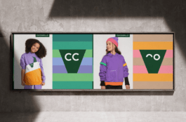
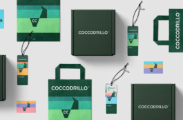
The brand’s empathy, its respect for the different moods of its customers, is expressed in its color palette, whose characteristic element is combinations of contrasting colors. On the one hand, the new palette respects the “Terracotta” shade developed by the brand over the years, on the other hand, it strengthens the main color by adding contrasting colors to it.


Copywriting & Strategy:
Łukasz Słotwiński
Brand & packaging design:
Jarosław Dziubek
Marta Goździewicz
Motion design:
Maria Demianiuk
Project management:
Jędrzej Mikucki
Piotr Chromiński
ANIA KRUK Team
Marketing & brand strategy:
Magda Polaszek
Piotr Jan Kulas
Photography:
Klaudia Kocielska
Video:
Fala Films Studio
Stylist:
Michał Karbowski
Set design:
Kinga Dembinska
Year
2025
Scope
→ Branding strategy
→ Brand design
→ Copywriting
→ Packaging design
→ Social Media schemes
→ Art Direction guides
The company was founded in 2012 by siblings, Anna Kruk-Vinas and Wojciech Kruk, who decided to continue the family business, giving it a more modern direction. Since its beginning, the ANIA KRUK brand has been breaking patterns and moving away from the classic approach to jewelry, introducing to the Polish market the concept of a brand specializing in everyday jewelry, closer to the word lifestyle than fashion or jewelry.
A follow-up to the everyday brand concept is the idea of Freedom of Wear. ANIA KRUK is jewelry that suits everyone and that can be wear as you like. Without any rules, regardless of style and occasion. The change in the brand’s logo and the entire identity reflects the courage to express oneself on a daily basis, directness and simplicity, without losing the essence of the brand - the new “a” signature is at the same time an earring, a hat or a pin.
Today all the moments of your day will happen. The hard ones and the easiest ones. The small encouragements and the small rewards. Great hopes and small reasons. All of those and the ones only. Neither then nor ever, only now. Today is your day.
ANIA KRUK jewelry is available for purchase in the aniakruk.pl online store, in more than a dozen boutiques located in major cities in Poland, as well as through third-party platforms, including Answear, Modivo, Allegro, Limango and Westwing. The brand is also present in the Baltona store chain, as well as in catalogs and on board LOT Polish Airlines flights.
The brand’s empathy, its respect for the different moods of its customers, is expressed in its color palette, whose characteristic element is combinations of contrasting colors. On the one hand, the new palette respects the “Terracotta” shade developed by the brand over the years, on the other hand, it strengthens the main color by adding contrasting colors to it.
Copywriting & Strategy:
Łukasz Słotwiński
Brand & packaging design:
Jarosław Dziubek
Marta Goździewicz
Motion design:
Maria Demianiuk
Project management:
Jędrzej Mikucki
Piotr Chromiński
ANIA KRUK Team
Marketing & brand strategy:
Magda Polaszek
Piotr Jan Kulas
Photography:
Klaudia Kocielska
Video:
Fala Films Studio
Stylist:
Michał Karbowski
Set design:
Kinga Dembinska