DOT2DOT – Square and Period.
Year
2021
Scope
→ Visual Identity
→ Copywriting
→ Visual communication guidelines
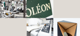
Behind the name DOT2DOT are three leading companies of the packaging production sector, merged in 2017, with their headquarters in Batorowo near Poznan, Gdansk and Sulejówek near Warsaw. The people behind the brand have been producing paper packaging for customers from all over the world for more than 30 years.
Task
The development of a new philosophy for the merged organizations and the accomplishment of the integration of three separate production facilities became the motivation for a change in the brand image. From now on, the company was to be seen as keeping up with the zeitgeist and the demands of the times, focused on advanced eco-type solutions.
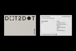
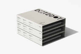
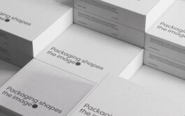
Packaging shapes the image
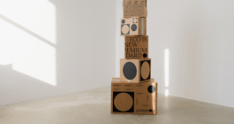
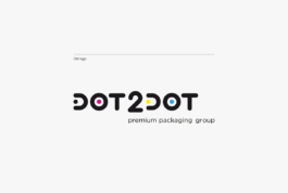
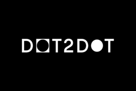
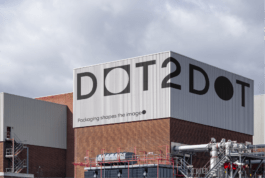
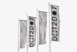
A core element of DOT2DOT’s identity is its tagline, 'Packaging shapes the image', which serves as the foundation for the entire visual identity. The logo directly reflects this concept through a clever visual metaphor: the first letter 'o'represents the packaging, while the second 'o' symbolizes the product inside-highlighting the critical role packaging plays in shaping a brand's image.
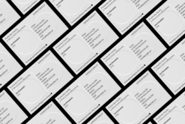
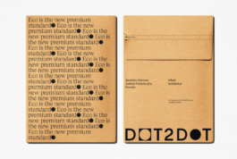
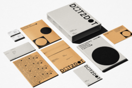
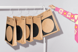
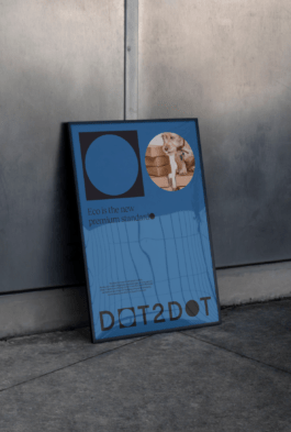

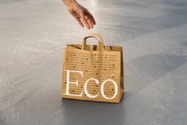
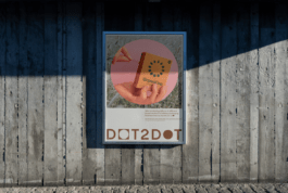
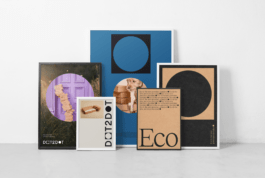
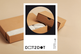
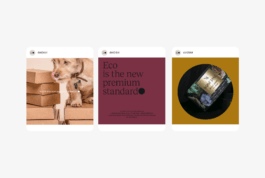
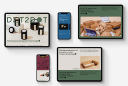
Manufacturing 1.2 trillion packages a year, DOT2DOT is one of the European leaders in its sector.
Brand Design:
Jarosław Dziubek
Copywriting:
Mariusz Ruciński
Project Management:
Agata Sędzikowska
DOT2DOT – Square and Period.
Year
2021
Scope
→ Visual Identity
→ Copywriting
→ Visual communication guidelines
Behind the name DOT2DOT are three leading companies of the packaging production sector, merged in 2017, with their headquarters in Batorowo near Poznan, Gdansk and Sulejówek near Warsaw. The people behind the brand have been producing paper packaging for customers from all over the world for more than 30 years.
The development of a new philosophy for the merged organizations and the accomplishment of the integration of three separate production facilities became the motivation for a change in the brand image. From now on, the company was to be seen as keeping up with the zeitgeist and the demands of the times, focused on advanced eco-type solutions.
A core element of DOT2DOT’s identity is its tagline, 'Packaging shapes the image', which serves as the foundation for the entire visual identity. The logo directly reflects this concept through a clever visual metaphor: the first letter 'o'represents the packaging, while the second 'o' symbolizes the product inside-highlighting the critical role packaging plays in shaping a brand's image.
The refined visual identity is further enhanced by serif typography, specifically dedicated to topics surrounding sustainability and eco-friendly solutions. Introducing an elegant serif font into green communications builds a sophisticated, responsible brand character and perfectly aligns with the principle that eco is the new premium standard.
Brand Design:
Jarosław Dziubek
Copywriting:
Mariusz Ruciński
Project Management:
Agata Sędzikowska