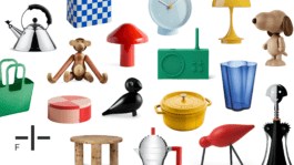
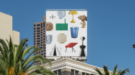
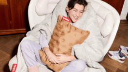
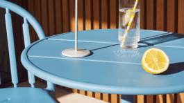
Fabryka Form is a brand offering designer furniture, accessories and objects for the home, interiors and garden. After the change, the brand no longer speaks only about products, but about the relationship people build with them. About the way objects settle into a space, shape a mood and become part of a personal style.
Year
2025
Scope
→ Brand strategy
→ Brand design
→ Copywriting
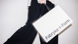
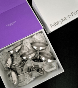
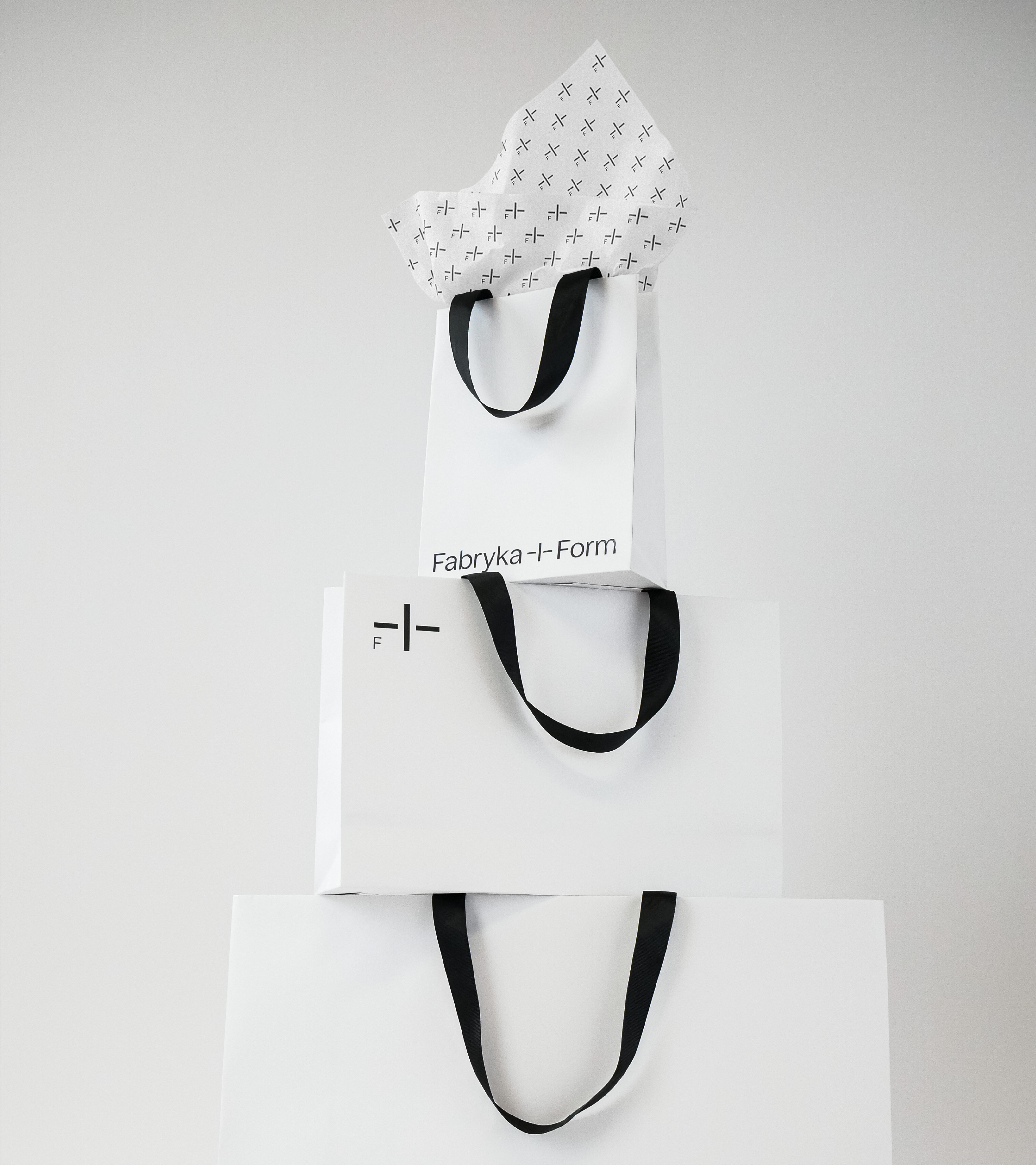
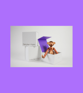
→ Packaging design
→ Visual communication guidelines
→ Social media communication schemes
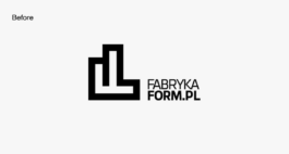
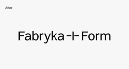
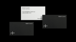
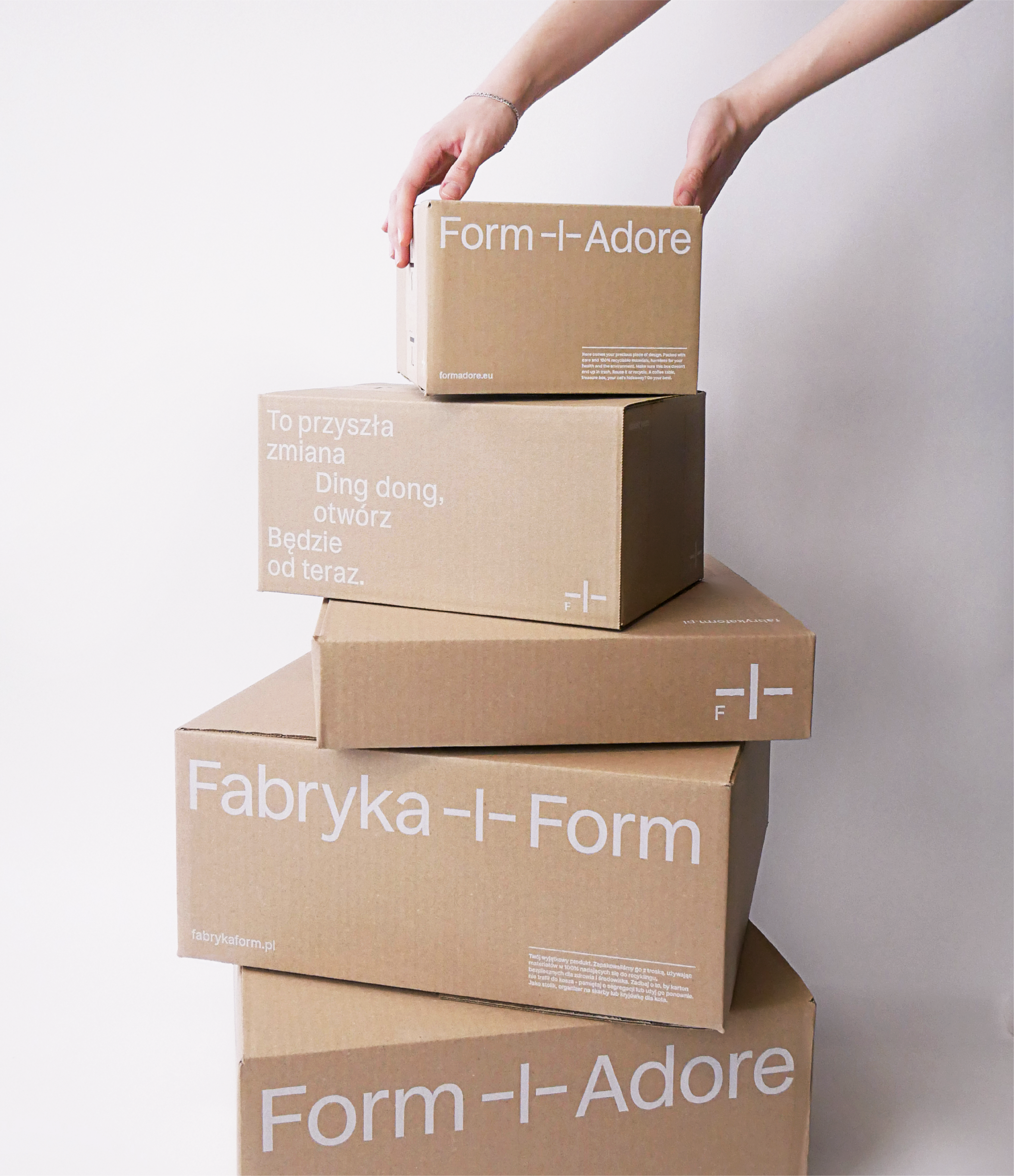
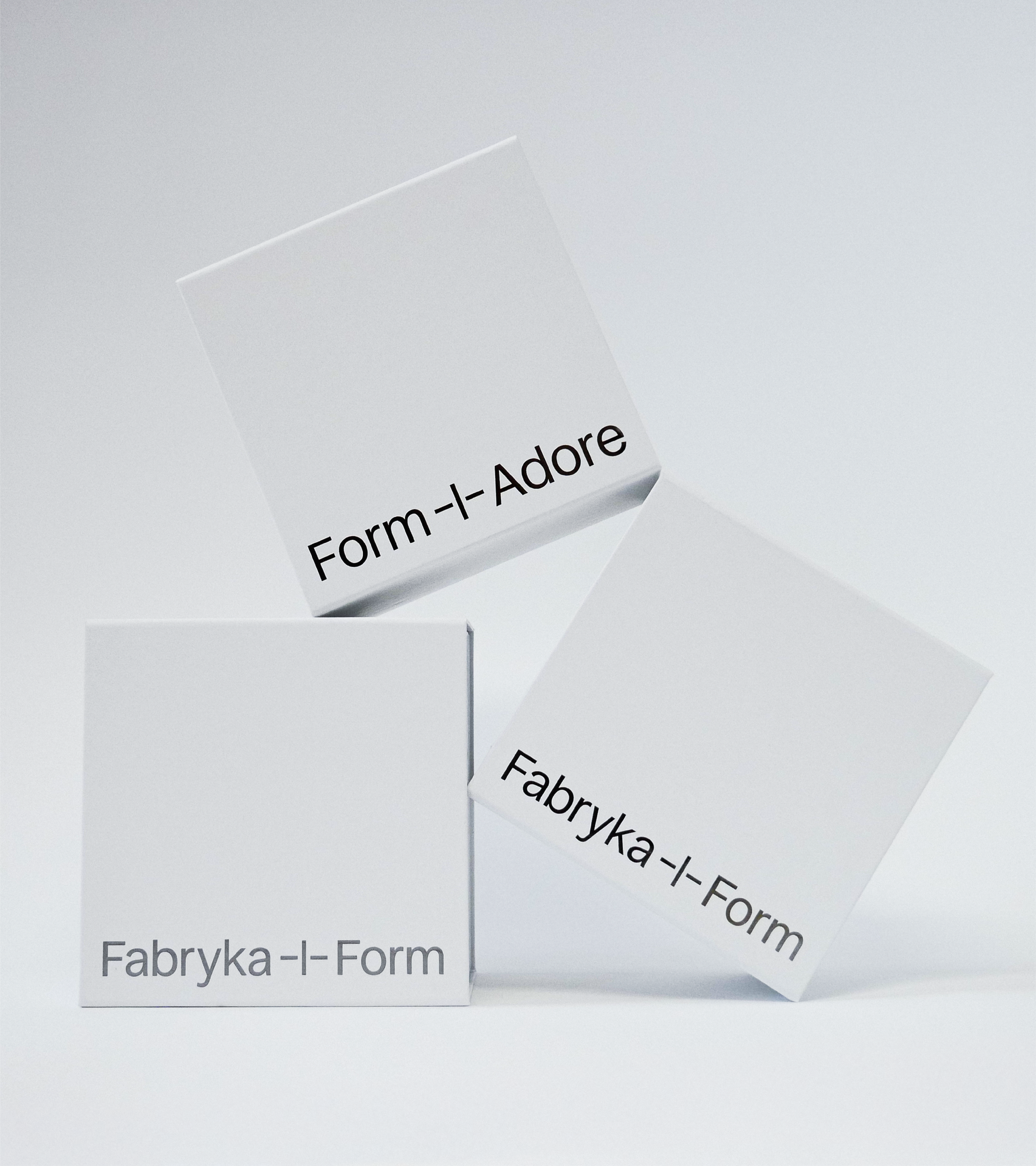
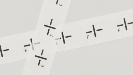
The distinctive plus motif became a key recognisable element of the brand, a point around which the entire communication system is built. The written form of the name also changed: all caps gave way to a more natural and mature form, with each word starting with a capital letter.
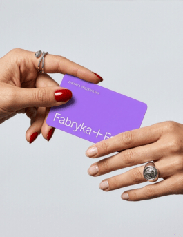
In Poland, the brand operates as Fabryka Form, while in international markets it is known as FormAdore.
The sign had to remain open to two names of different length and proportion. Its axis became a central point, derived from the lines of domestic shelves, objects and spaces that the brand organises, presents and allows people to arrange in their own way.
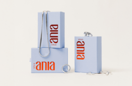
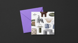
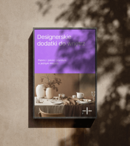
The logo adapts to product categories. Each of them received its own color, making the extensive catalogue clearer and the offer easier, simpler and more intuitive to navigate.
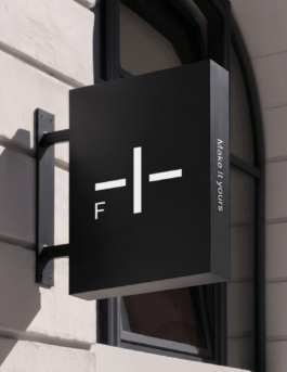
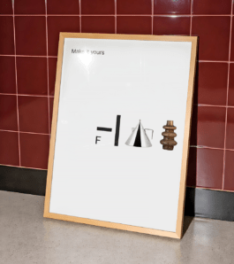
The brand’s leading slogan, “Make it yours”, works as an invitation. It does not impose a style, but opens space for individual choices, needs and ways of living.
It is a simple idea that holds the entire communication together: a home is not a finished composition. It becomes yours only when you start arranging it in your own way.
The layout system is based on clarity, elegance and visual rhythm. One of its main principles is the rule of three, derived from the construction of the sign.
Just as the logo is built from three elements, the brand’s materials often divide composition or content into three parts. This can appear in text breaks, spatial organisation or the building of rhythm in visual sequences. The principle brings order to the message, but also gives the identity its own recognisable logic.
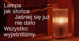
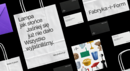
A system of short haiku-like poems introduces a light, repeatable rhythm into the communication. Regardless of language, culture or place of use, the brand speaks through the same structure: concisely, visually and with space for interpretation.
As a result, Fabryka Form’s communication is not reduced to product description. It creates small scenes from the life of objects, moments in which the home begins to speak in its own voice.
Dominika Gauza
Content + Communication Manager
Fabryka Form
In its color logic, the brand works like a passe-partout for the offer. It does not compete with the products, but creates a calm, flexible frame for them.
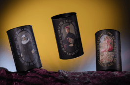
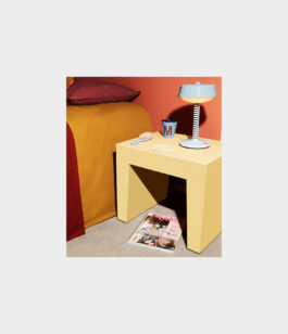
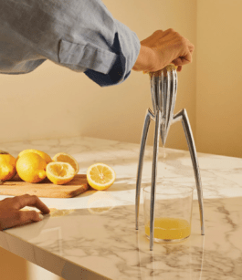
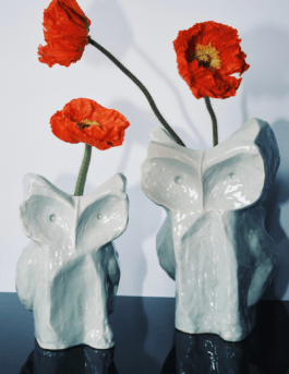
The objects themselves become the visual language: their forms, functions, textures and everyday contexts. The brand narrative focuses on moments, places and feelings connected with home, creating a system that can be developed across many markets and in many languages.
The change, introduced in the middle of the year, resonated most strongly during Black Friday, generating high interest and a large number of orders. It was proof that the new communication was well received. The brand gained not only a more coherent language, but also a real, visible sales effect.
Michał Wrzesień
CEO
Fabryka Form
Logo & Brand idea:
Adrian Spóz
Strategy & Copywriting:
Łukasz Słotwiński
Brand design:
Marta Goździewicz
Adrian Spóz
Maria Demianiuk
Łukasz Słotwiński
Motion design:
Maria Demianiuk
Project Management:
Agata Sędzikowska
Photography:
Łukasz Słotwiński
Maria Demianiuk
Product imagery supplied by Fabryka Form, courtesy of the respective product brands.
Year
2025
Scope
→ Brand strategy
→ Brand design
→ Copywriting
→ Packaging design
→ Visual communication guidelines
→ Social media communication schemes
Fabryka Form is a brand offering designer furniture, accessories and objects for the home, interiors and garden. After the change, the brand no longer speaks only about products, but about the relationship people build with them. About the way objects settle into a space, shape a mood and become part of a personal style.
The distinctive plus motif became a key recognisable element of the brand, a point around which the entire communication system is built. The written form of the name also changed: all caps gave way to a more natural and mature form, with each word starting with a capital letter.
In Poland, the brand operates as Fabryka Form, while in international markets it is known as FormAdore.
The sign had to remain open to two names of different length and proportion. Its axis became a central point, derived from the lines of domestic shelves, objects and spaces that the brand organises, presents and allows people to arrange in their own way.
The logo adapts to product categories. Each of them received its own color, making the extensive catalogue clearer and the offer easier, simpler and more intuitive to navigate.
The brand’s leading slogan, “Make it yours”, works as an invitation. It does not impose a style, but opens space for individual choices, needs and ways of living.
It is a simple idea that holds the entire communication together: a home is not a finished composition. It becomes yours only when you start arranging it in your own way.
The layout system is based on clarity, elegance and visual rhythm. One of its main principles is the rule of three, derived from the construction of the sign.
Just as the logo is built from three elements, the brand’s materials often divide composition or content into three parts. This can appear in text breaks, spatial organisation or the building of rhythm in visual sequences. The principle brings order to the message, but also gives the identity its own recognisable logic.
A system of short haiku-like poems introduces a light, repeatable rhythm into the communication. Regardless of language, culture or place of use, the brand speaks through the same structure: concisely, visually and with space for interpretation.
As a result, Fabryka Form’s communication is not reduced to product description. It creates small scenes from the life of objects, moments in which the home begins to speak in its own voice.
Dominika Gauza
Content + Communication Manager
Fabryka Form
In its color logic, the brand works like a passe-partout for the offer. It does not compete with the products, but creates a calm, flexible frame for them.
The objects themselves become the visual language: their forms, functions, textures and everyday contexts. The brand narrative focuses on moments, places and feelings connected with home, creating a system that can be developed across many markets and in many languages.
The change, introduced in the middle of the year, resonated most strongly during Black Friday, generating high interest and a large number of orders. It was proof that the new communication was well received. The brand gained not only a more coherent language, but also a real, visible sales effect.
Michał Wrzesień
CEO
Fabryka Form
Logo & Brand idea:
Adrian Spóz
Strategy & Copywriting:
Łukasz Słotwiński
Brand design:
Marta Goździewicz
Adrian Spóz
Maria Demianiuk
Łukasz Słotwiński
Motion design:
Maria Demianiuk
Project Management:
Agata Sędzikowska
Photography:
Łukasz Słotwiński
Maria Demianiuk
Product imagery supplied by Fabryka Form, courtesy of the respective product brands.