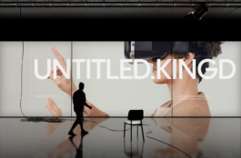
Just outside of Poznań, in Plewiska, sits one of Europe's largest design and production facilities for lanyards and other promotional gadgets. This is the TedGifted company.
Klient
tedgifted.com
Year
2024
Scope
→ Branding
→ Copywriting
→ UX / UI Consulting
→ Workshops


Producing more than 40,000 lanyards a week, the charismatically managed Ted is the Polish market leader. Ironically, the production capacity is even greater. Together with high technological competence and experienced customer service, they create a competitive advantage that is not fully reflected in the brand image and its touch points.

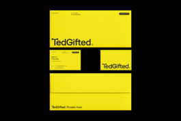


The rebranding process has become one of the catalysts for change, which is expected to bring about harmony in production capabilities, product quality, service and brand image. At the level of its DNA, the brand remained a professionally friendly consultant. With a personality rooted in millions of orders served and a new face that has been stripped of the face of the American salesman. Brought down to the symbol of a bow tie inscribed with the first letter of the brand's name.


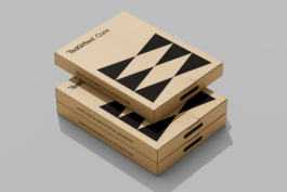

A gadget company uses clean visualizations of products on a daily basis. This presents a problem because a clean model is not appealing, on the other hand, any design applied to the visualization could confuse the customer. Incorporating the brand's mark into the letter of the logo opened up the possibility of addressing these issues. Standard product models remain clean, while incorporating an element of branding that engages in a conversation with the viewer at the primary point of contact.


Branding strategy & Copywriting:
Łukasz Słotwiński
Brand design:
Adrian Spóz
Jarosław Dziubek
Maria Demianiuk
UX / UI Consulting:
Maciej Zając
Project Manager:
Jędrzej Mikucki
Masza Zabrocka

Bronze KTR 2024 - Logo
Year
2024
Scope
→ Branding
→ Copywriting
→ UX / UI Consulting
→ Workshops
Client
Just outside of Poznań, in Plewiska, sits one of Europe's largest design and production facilities for lanyards and other promotional gadgets. This is the TedGifted company.
Producing more than 40,000 lanyards a week, the charismatically managed Ted is the Polish market leader. Ironically, the production capacity is even greater. Together with high technological competence and experienced customer service, they create a competitive advantage that is not fully reflected in the brand image and its touch points.
The rebranding process has become one of the catalysts for change, which is expected to bring about harmony in production capabilities, product quality, service and brand image. At the level of its DNA, the brand remained a professionally friendly consultant. With a personality rooted in millions of orders served and a new face that has been stripped of the face of the American salesman. Brought down to the symbol of a bow tie inscribed with the first letter of the brand's name.
A gadget company uses clean visualizations of products on a daily basis. This presents a problem because a clean model is not appealing, on the other hand, any design applied to the visualization could confuse the customer. Incorporating the brand's mark into the letter of the logo opened up the possibility of addressing these issues. Standard product models remain clean, while incorporating an element of branding that engages in a conversation with the viewer at the primary point of contact.
Branding strategy & Copywriting:
Łukasz Słotwiński
Brand design:
Adrian Spóz
Jarosław Dziubek
Maria Demianiuk
UX / UI Consulting:
Maciej Zając
Project Manager:
Jędrzej Mikucki
Masza Zabrocka
Bronze KTR 2024 - Logo