
The Upper Silesian Metropolis is 41 cities integrated, among other things, to provide common transportation for more than 2.5 million passengers, who were lost in a multitude of markings on every day basis. As part of the work on the visual identification of GZM Transport, we were asked to make the language of communication more consistent in terms of iconography. We created more than 100 pictograms that help different groups of passengers use transportation and bring order to public space.
Year
2022
Scope
→ Pictogram Design
→ System structure
→ Animation
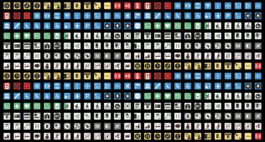
Did you know that just one bus is between 100 and 150 markings, very often created and “pasted” over the years. Streamlining pursues primarily informational and organizational goals, secondarily aesthetic.


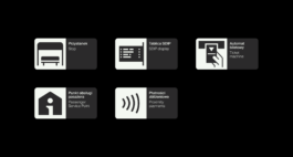


Based on an analysis of the perception of signs we created a flexible grid that sets the direction for subsequent signage for the future. The system will be implemented in more than 1,800 vehicles, as well as in the fixed infrastructure, portal and mobile app.


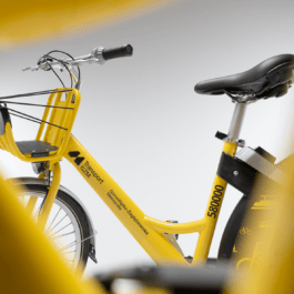





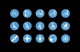


A passenger-readable, easy-to-use public transportation system pursues one overarching goal: to encourage direct and indirect use of the public transportation system.

Design:
Adrian Spóz
Project Manager:
Agata Sędzikowska

Year
2022
Scope
→ Pictogram Design
→ System structure
→ Animation
The Upper Silesian Metropolis is 41 cities integrated, among other things, to provide common transportation for more than 2.5 million passengers, who were lost in a multitude of markings on every day basis. As part of the work on the visual identification of GZM Transport, we were asked to make the language of communication more consistent in terms of iconography. We created more than 100 pictograms that help different groups of passengers use transportation and bring order to public space.

Did you know that just one bus is between 100 and 150 markings, very often created and “pasted” over the years. Streamlining pursues primarily informational and organizational goals, secondarily aesthetic.


Based on an analysis of the perception of signs we created a flexible grid that sets the direction for subsequent signage for the future. The system will be implemented in more than 1,800 vehicles, as well as in the fixed infrastructure, portal and mobile app.


A passenger-readable, easy-to-use public transportation system pursues one overarching goal: to encourage direct and indirect use of the public transportation system.

Design:
Adrian Spóz
Project Manager:
Agata Sędzikowska