
Aldona and Pawel - two innovators previously unconnected with the alcohol industry - approached us in the post-pandemic reality looking for original creative solutions for their new initiative: a 40% pure rye vodka. Since the product had no local or family history we gave it a completely different character, focusing on the substance itself and its effect on the consumer.
Year
2022
Scope
Corporate identity, packaging design, social media.
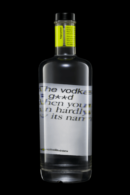
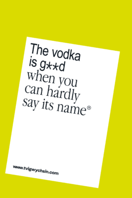
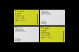
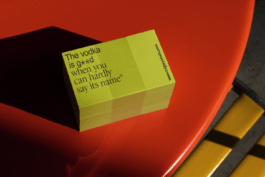
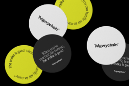
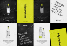
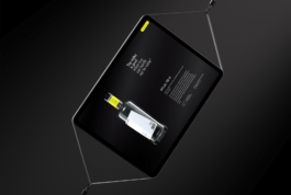
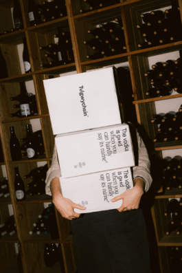
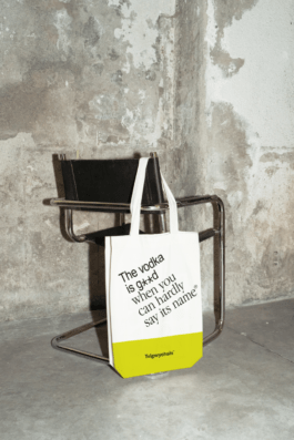
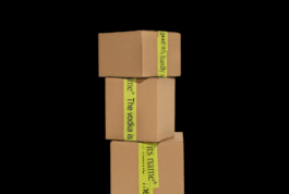
Vodka is good if you can’t pronounce its name - the acronym of that phrase became the product's name. That’s how we get into the game with the audience from the first “you can’t pronounce it or read it”. We continue it with a twisted label and the architecture of typography. We act on consciousness, memories, we want you to react.

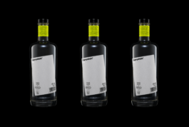

The design in its stripped-down form promises a clear and intense taste with citrus accents. The brand and packaging is like the vodka inside - lightly pinching and leaving no one indifferent.
Tvigwychsin vodka is produced from organic rye and subjected to multiple filtration processes. The designers responded with advanced printing techniques. The label is three-layer, partially printed from inside the bottle.

The design was also developed with gift functions in mind - the tube could be easily turned into a special gift with handwritten dedication space left intentionally on the side.

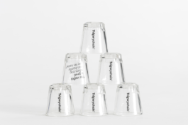



→ KTR Award, Communication / Art direction, Bronze — 2023
Visual Identity: Maciej Bączkowski
Packaging Design: Maciej Bączkowski
Project Manager: Agata Sędzikowska, Masza Zabrocka

Year
2022
Scope
Corporate identity, packaging design, social media.
Aldona and Pawel - two innovators previously unconnected with the alcohol industry - approached us in the post-pandemic reality looking for original creative solutions for their new initiative: a 40% pure rye vodka. Since the product had no local or family history we gave it a completely different character, focusing on the substance itself and its effect on the consumer.


The design in its stripped-down form promises a clear and intense taste with citrus accents. The brand and packaging is like the vodka inside - lightly pinching and leaving no one indifferent.


Tvigwychsin vodka is produced from organic rye and subjected to multiple filtration processes. The designers responded with advanced printing techniques. The label is three-layer, partially printed from inside the bottle.


→ KTR Award, Communication / Art direction, Bronze — 2023
Visual Identity: Maciej Bączkowski
Packaging Design: Maciej Bączkowski
Project Manager: Agata Sędzikowska, Masza Zabrocka