
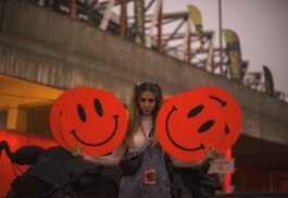
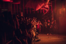
A limited number of participants, a full sanitation regime and a hybrid format was the context in which the 11th edition of the iconic festival of club, electronic and hip-hop sounds was held. From the beginning, the organizers were active in the pandemic, transferring some of the activity to online profiles, aiming all the time for the festival to also take place live. Although in a limited form. The concrete casts included in the identity are a kind of tribute to this persistence and steadfastness.
Year
2020
Scope
Brand design, collateral, copywriting, corporate & verbal identity, outdoor, print design, signage & wayfinding.

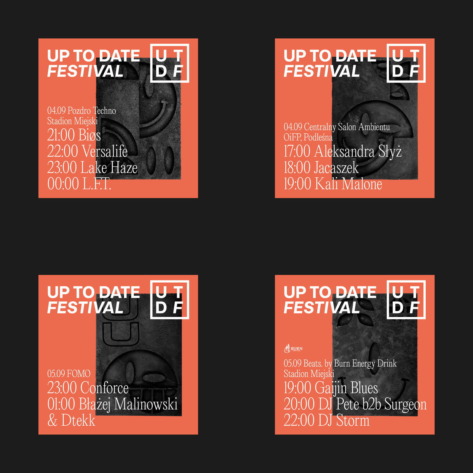
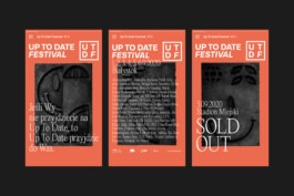
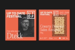
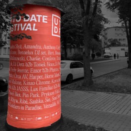
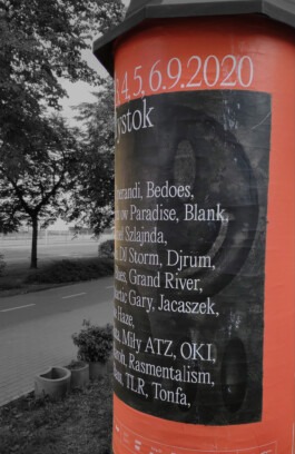
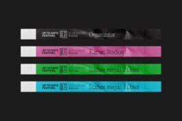
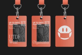
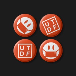
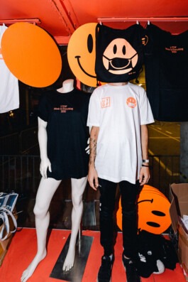
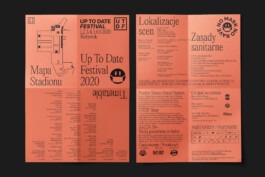
After 10 years of the festival's existence, the logo could be shortened to an acronym. In its new form, it strengthens its message and expands its functionality. The logo gains greater freedom of use, better readability and usability.


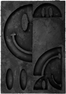
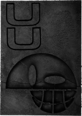
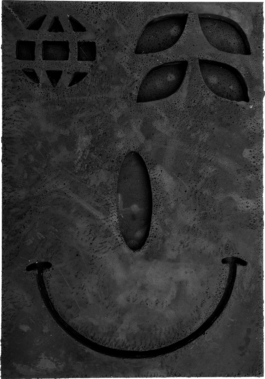
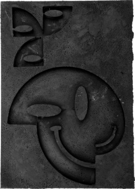
The visual axis of opposition against the pandemic situation is contained in the concrete reliefs made by Karolina Maksymowicz. They are a protest, a place, a city, a disruption of order.
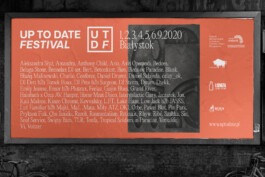
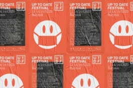
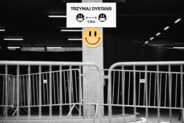

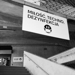
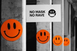
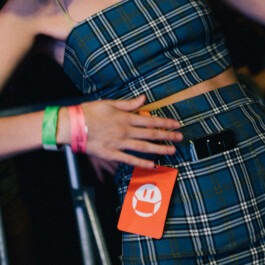
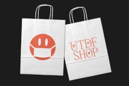
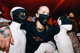
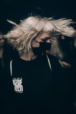
Due to the situation, the standard set of festival icons had to be enriched with icons related to the sanitation regime.

Visual Identity: Grzegorz Sołowiński, Karolina Maksymowicz

Year
2020
Scope
Brand design, collateral, copywriting, corporate & verbal identity, outdoor, print design, signage & wayfinding.
A limited number of participants, a full sanitation regime and a hybrid format was the context in which the 11th edition of the iconic festival of club, electronic and hip-hop sounds was held. From the beginning, the organizers were active in the pandemic, transferring some of the activity to online profiles, aiming all the time for the festival to also take place live. Although in a limited form. The concrete casts included in the identity are a kind of tribute to this persistence and steadfastness.

After 10 years of the festival's existence, the logo could be shortened to an acronym. In its new form, it strengthens its message and expands its functionality. The logo gains greater freedom of use, better readability and usability.


The visual axis of opposition against the pandemic situation is contained in the concrete reliefs made by Karolina Maksymowicz. They are a protest, a place, a city, a disruption of order.


Due to the situation, the standard set of festival icons had to be enriched with icons related to the sanitation regime.


Visual Identity: Grzegorz Sołowiński, Karolina Maksymowicz