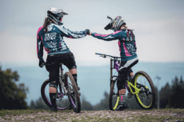
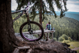
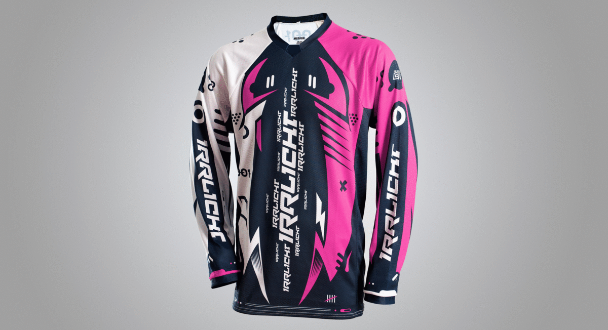
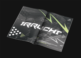
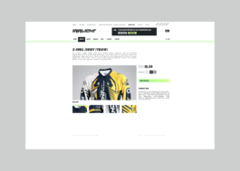
Irrlicht – German downhill biking apparel brand – asked us to design a full scope branding for their company, enhancing the spirit of their products. Downhill mountain biking is a dangerous sport, practised on steep, rocky, rough terrain, where only the quickest reflexes and the highest speeds count. The visual identity we presented is all about this adrenaline rush.
Year
2013
Scope
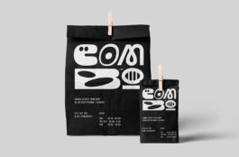
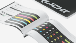
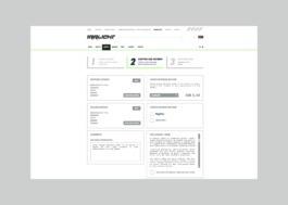
Brand design, corporate identity, product design, collateral, illustrations, print design, press ads, website design, social media, packaging design, brand manual.
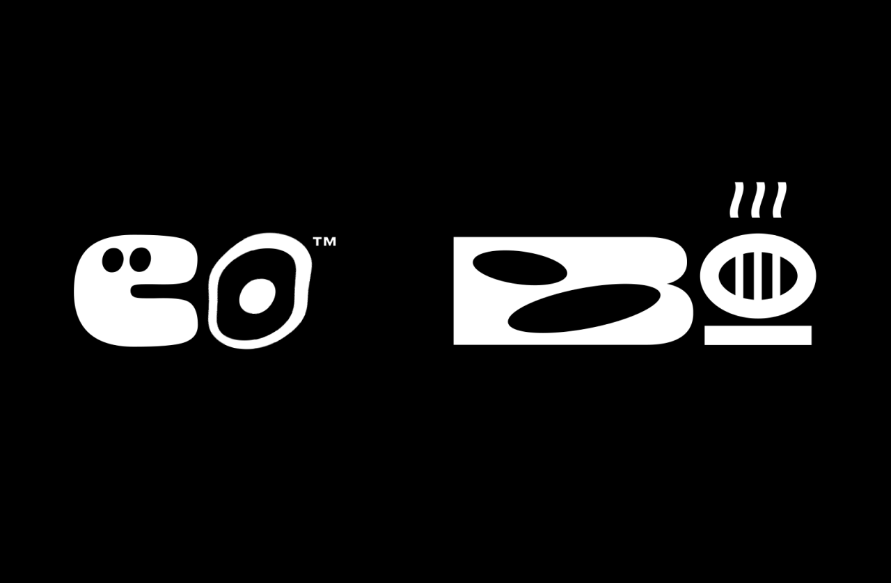
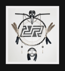
– this and more translated into a visual language of shapes, marks and letters. The dynamics of the logotype and its background fit perfectly in the reality of the extreme sport, complementing the branding materials, defining what the world of Irrlicht actually is.
We wanted bikers to identify themselves with our design quickly. The products needed to have this authentic feel of expressiveness and competitiveness, but also just pure fun.
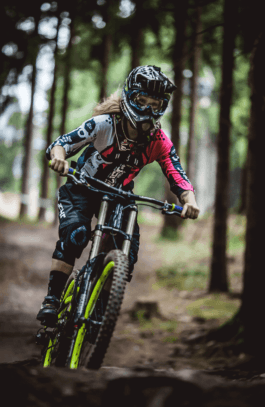
Riding a bike 55 km/h off a rocky mountain slope is not something ordinary. The brand had to be extraordinary as well.
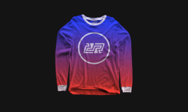
We wanted the products to be more than just merchandise. By designing in such an emotional way, where everything was about enhancing the experience, we hoped to spark the socialising spirit between Irrlicht customers, and tighten bonds in their riding community.


Stefan Fischer
CEO & Founder, Irrlicht
Visual Identity: Adrian Spóz, Maciej Frymus
Year
2013
Scope
Brand design, corporate identity, product design, collateral, illustrations, print design, press ads, website design, social media, packaging design, brand manual.
Irrlicht – German downhill biking apparel brand – asked us to design a full scope branding for their company, enhancing the spirit of their products. Downhill mountain biking is a dangerous sport, practised on steep, rocky, rough terrain, where only the quickest reflexes and the highest speeds count. The visual identity we presented is all about this adrenaline rush.
– this and more translated into a visual language of shapes, marks and letters. The dynamics of the logotype and its background fit perfectly in the reality of the extreme sport, complementing the branding materials, defining what the world of Irrlicht actually is.
We wanted bikers to identify themselves with our design quickly. The products needed to have this authentic feel of expressiveness and competitiveness, but also just pure fun.
Riding a bike 55 km/h off a rocky mountain slope is not something ordinary. The brand had to be extraordinary as well.
We wanted the products to be more than just merchandise. By designing in such an emotional way, where everything was about enhancing the experience, we hoped to spark the socialising spirit between Irrlicht customers, and tighten bonds in their riding community.
Stefan Fischer
CEO & Founder, Irrlicht