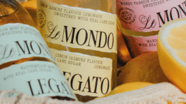
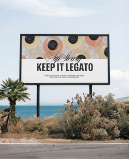
Le Mondo Legato is a lemonade brand built from scratch – from identity to packaging. The ambition was to create a product with a bold, distinct identity that steps outside visual category conventions, feeling equally at home on a restaurant table, a bar counter, or a retail shelf. Rather than building the brand out of multiple decorative elements, we searched for a single strong idea that could define the entire system.
Year
2025
Scope
→ Brand strategy
→ Brand design
→ Copywriting
→ Packaging design
→ Visual communication guidelines
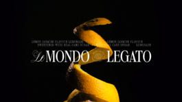
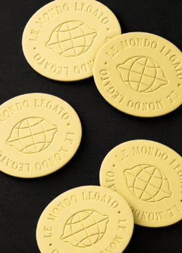
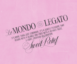
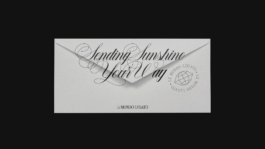
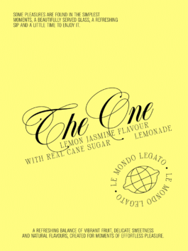
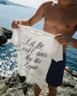
Le Mondo Legato was meant to inhabit the world of modern gastronomy and fine bars rather than the traditional soft drinks category. We moved away from literal fruit illustrations and obvious color-coded flavors. Instead, we crafted a more refined, tactile brand universe rooted in engravings, textures, paper, and classic typography. Serif typography establishes elegance and timelessness, while a calligraphic stroke introduces fluidity, rhythm, and motion. The system is completed by a distinctive logomark as another recognizable brand element. It wasn't about making a lemonade that simply looks premium. It was about creating a language of its own.
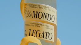
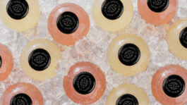
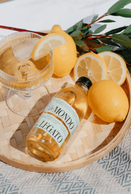
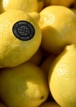
The starting point was the most fundamental element of a citrus fruit – its peel. Instead of treating it as an illustration, we approached it as a material: elongated, fluid, and spatial. It was the peel that gave the bottle its signature form and became the central motif of the entire brand identity. It naturally connected the product to the name Le Mondo Legato – embracing its musicality, rhythm, and fluidity. A single idea began to wrap the entire brand.

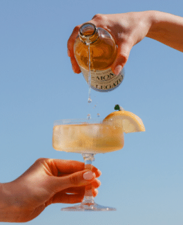
The name references the idea of bringing worlds together. Every lemonade is a melody of its own – two ingredients in perfect harmony. A flavor that flows effortlessly, like a smooth legato sound.
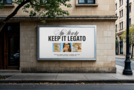
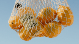
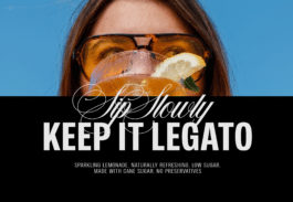
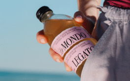

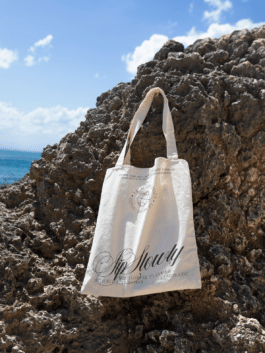
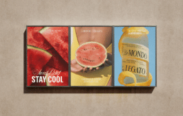

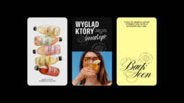

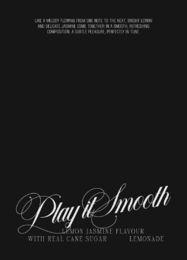
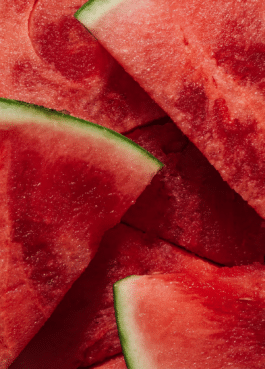
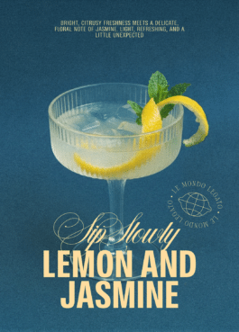
Each Le Mondo Legato variant merges two flavors into a single, harmonious composition. The visual identity reflects this exact concept: every label's color is born from combining the shades of its two ingredients, creating a seamless system where taste transforms into color.





Brand Design:
Marta Goździewicz
Naming & Copywriting:
Łukasz Słotwiński
Motion Design:
Maria Demianiuk
Photography / Photo Shoot:
Anya Buhaiova
Maria Demianiuk
Anastasiia Onikiienko
Project Management:
Agata Sędzikowska

Gold KTR 2026 - Packaging
Year
2025
Scope
→ Brand strategy
→ Brand design
→ Copywriting
→ Packaging design
→ Visual communication guidelines
Le Mondo Legato is a lemonade brand built from scratch – from identity to packaging. The ambition was to create a product with a bold, distinct identity that steps outside visual category conventions, feeling equally at home on a restaurant table, a bar counter, or a retail shelf. Rather than building the brand out of multiple decorative elements, we searched for a single strong idea that could define the entire system.
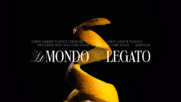
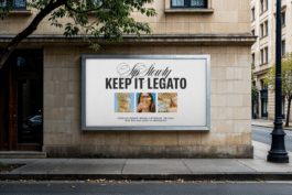
Le Mondo Legato was meant to inhabit the world of modern gastronomy and fine bars rather than the traditional soft drinks category. We moved away from literal fruit illustrations and obvious color-coded flavors. Instead, we crafted a more refined, tactile brand universe rooted in engravings, textures, paper, and classic typography. Serif typography establishes elegance and timelessness, while a calligraphic stroke introduces fluidity, rhythm, and motion. The system is completed by a distinctive logomark as another recognizable brand element. It wasn't about making a lemonade that simply looks premium. It was about creating a language of its own.
The starting point was the most fundamental element of a citrus fruit – its peel. Instead of treating it as an illustration, we approached it as a material: elongated, fluid, and spatial. It was the peel that gave the bottle its signature form and became the central motif of the entire brand identity. It naturally connected the product to the name Le Mondo Legato – embracing its musicality, rhythm, and fluidity. A single idea began to wrap the entire brand.
The name references the idea of bringing worlds together. Every lemonade is a melody of its own – two ingredients in perfect harmony. A flavor that flows effortlessly, like a smooth legato sound.

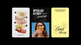
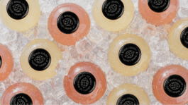
Each Le Mondo Legato variant merges two flavors into a single, harmonious composition. The visual identity reflects this exact concept: every label's color is born from combining the shades of its two ingredients, creating a seamless system where taste transforms into color.

Brand Design:
Marta Goździewicz
Naming & Copywriting:
Łukasz Słotwiński
Motion Design:
Maria Demianiuk
Photography / Photo Shoot:
Anya Buhaiova
Maria Demianiuk
Anastasiia Onikiienko
Project Management:
Agata Sędzikowska
Gold KTR 2026 - Packaging