
Mobee Dick is a UX design studio that specialises in mobile solutions. Having an already well-established expert image in Poland, the company decided to expand abroad. There was a need for a visual identity to better reflect the ambitions of the team and the high level of services it provides.
Our task was to introduce a new visual communication strategy that reflects the spirit of the company, as well as changing its current image. Mobee Dick was to be friendly, pleasant, and at the same time representing the nature and specificity of the mobile UX industry. We were asked to make the brand emotional and make a reference to the whale that was used in the previous logo.
Year
2016
Scope
Branding, collateral, corporate identity, illustrations, print design, social media.

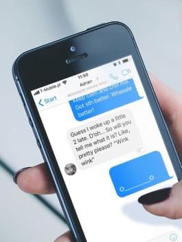
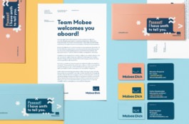
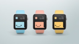
The background of a chat message has a shape similar to a whale. By entering appropriate emoticons, such as ^ _ ^, you can give it a facial expression. As a result, the Mobee Dick logo can basically be hand-made by anyone just by using a messenger.
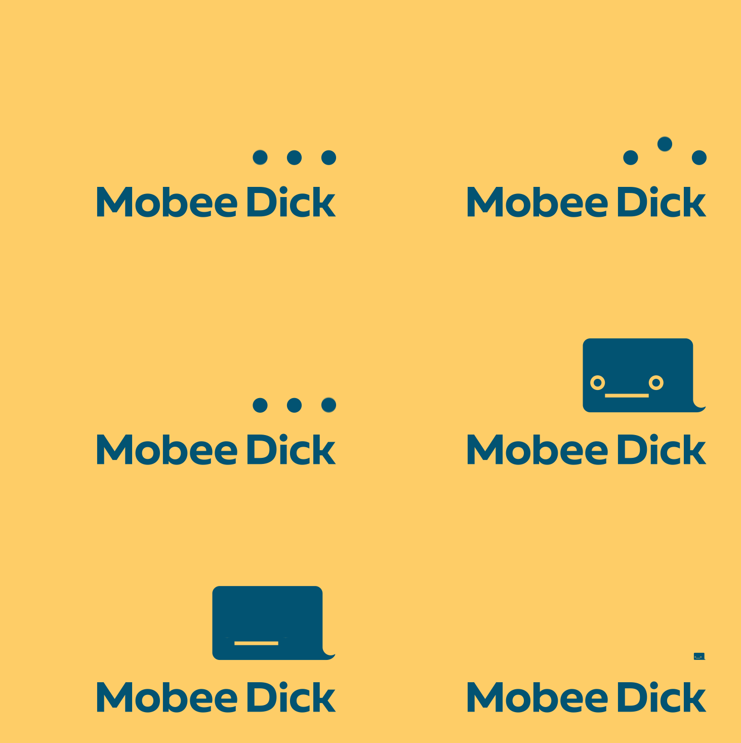
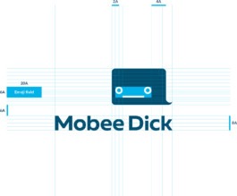
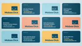
Depending on the needs and context, its colours and facial expressions are changed with different symbols in the style of emojis, thanks to which we can smoothly control the emotions of the message. For example, a business card of each employee has a different smiley, the background of the invoice is a huge dollar sign, which can also be seen in the eyes of the whale at the bottom.




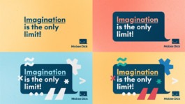
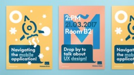
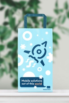
All graphics (animations, stationery, etc.) are based on a set of chat symbols specially arranged to create complex imagery, e.g. a rocket with letters and brackets flying against the stars. In this way, we merge fun, communication and mobility and at the same time, we introduce the brand’s hero.

Monika Mikowska
CEO, Mobee Dick


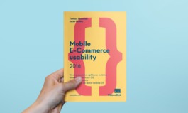
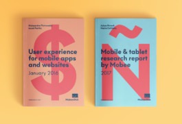


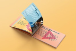


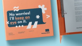
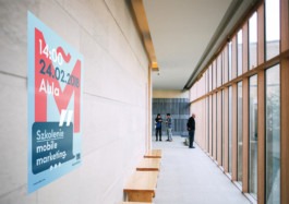
The identity is flexible enough to be used in a small and a large scale in any possible medium, so no matter what stage of growth Mobee Dick is in, the CI is adequate. The fun and joy defining the brand complement the business part, enhancing the team’s morale and strengthening the company’s credibility.

→ PGD Awards, Visual Identity — 2017
→ RE:PL Rebranding of the Year — 2017
Strategy: Maciej Frymus
Visual Identity: Adrian Spóz, Maciej Frymus
Verbal Identity: Mobee Dick

Year
2016
Scope
Branding, collateral, corporate identity, illustrations, print design, social media.
Mobee Dick is a UX design studio that specialises in mobile solutions. Having an already well-established expert image in Poland, the company decided to expand abroad. There was a need for a visual identity to better reflect the ambitions of the team and the high level of services it provides.
Our task was to introduce a new visual communication strategy that reflects the spirit of the company, as well as changing its current image. Mobee Dick was to be friendly, pleasant, and at the same time representing the nature and specificity of the mobile UX industry. We were asked to make the brand emotional and make a reference to the whale that was used in the previous logo.


The background of a chat message has a shape similar to a whale. By entering appropriate emoticons, such as ^ _ ^, you can give it a facial expression. As a result, the Mobee Dick logo can basically be hand-made by anyone just by using a messenger.
Depending on the needs and context, its colours and facial expressions are changed with different symbols in the style of emojis, thanks to which we can smoothly control the emotions of the message. For example, a business card of each employee has a different smiley, the background of the invoice is a huge dollar sign, which can also be seen in the eyes of the whale at the bottom.


All graphics (animations, stationery, etc.) are based on a set of chat symbols specially arranged to create complex imagery, e.g. a rocket with letters and brackets flying against the stars. In this way, we merge fun, communication and mobility and at the same time, we introduce the brand’s hero.


Monika Mikowska
CEO, Mobee Dick


The identity is flexible enough to be used in a small and a large scale in any possible medium, so no matter what stage of growth Mobee Dick is in, the CI is adequate. The fun and joy defining the brand complement the business part, enhancing the team’s morale and strengthening the company’s credibility.


→ PGD Awards, Visual Identity — 2017
→ RE:PL Rebranding of the Year — 2017
Strategy: Maciej Frymus
Visual Identity: Adrian Spóz, Maciej Frymus
Verbal Identity: Mobee Dick